trAIn 121
Elevating Athletic Performance
Excel: The Manual Productivity Killer
Migrating to Automation and AI
Coaches grapple with hundreds of manual, Excel-based training programs that lack coach-friendly design. This manual workload takes away valuable time that they could spend coaching.


Collegiate Coaches
Always looking for that competitive edge
Collegiate coaches are the primary target user. They are frustrated when they can’t offer the best training opportunities to their athletes. They are determined to find a solution that allows them to compete at a high level and provide their athletes with the best possible training.
Straight from the source
An 8-Week sprint to the finish
Initial Research & Goal Setting
Before even sketching the first wireframe, I took a deep-dive into the research that was available from the founders and started an inspiration board to get some ideas flowing. I also collaborated with the Lead Creative Director to understand business objectives and user pain points better. This helped me set clear goals for the user experience design.
Competitive Analysis
I scoped out the competition to identify gaps and opportunities. This gave us insights into where we could offer better solutions.


User Stories & Flows
With a clearer view of the market and our users, I drafted user stories and created user flows for different scenarios and workflows that users might encounter.
User Flows
These user flows outline the streamlined process for various sections of the platform. This design emphasizes ease of navigation and a user-centered approach, ensuring a smooth and intuitive experience.
Design Iterations
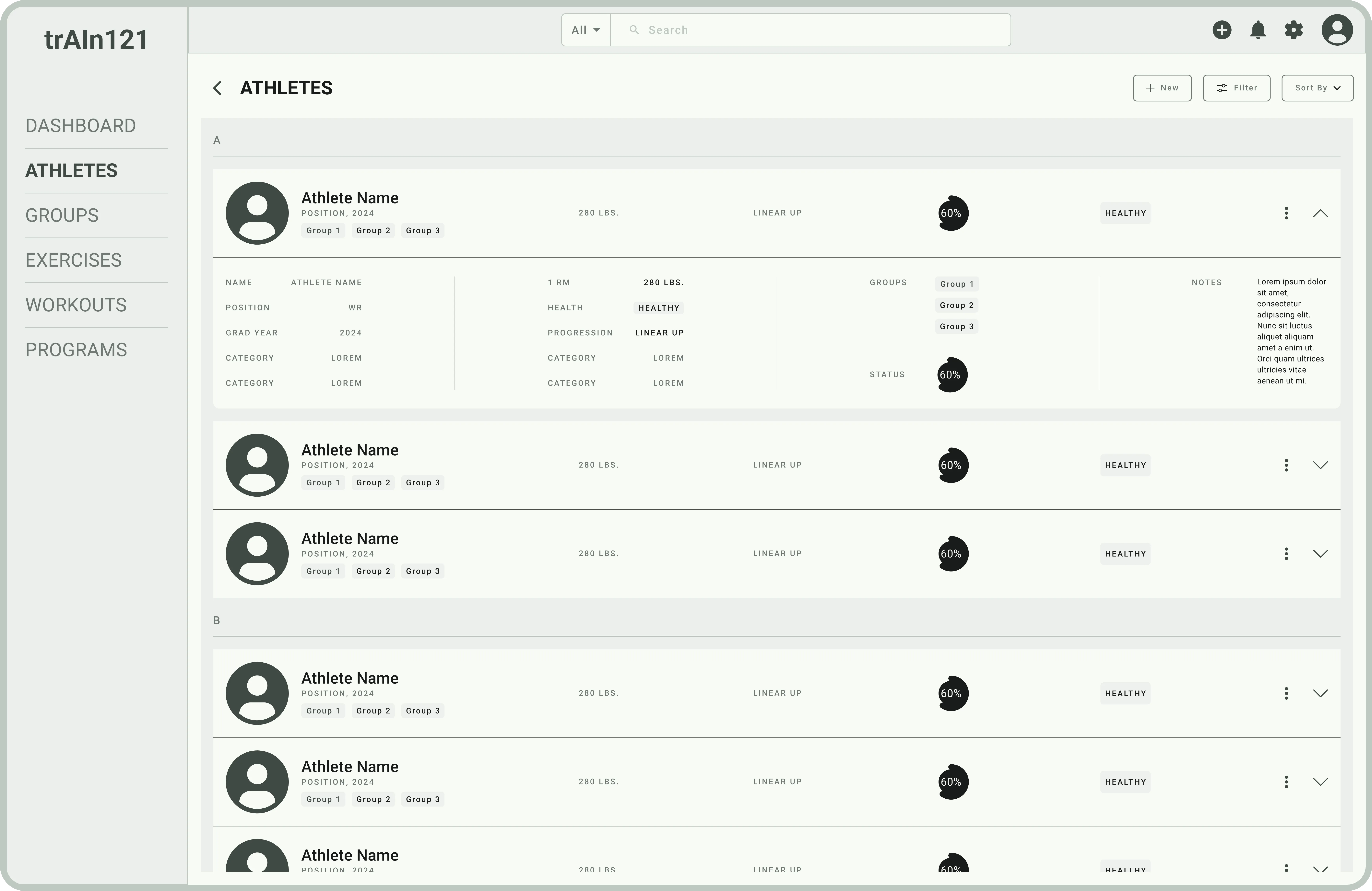
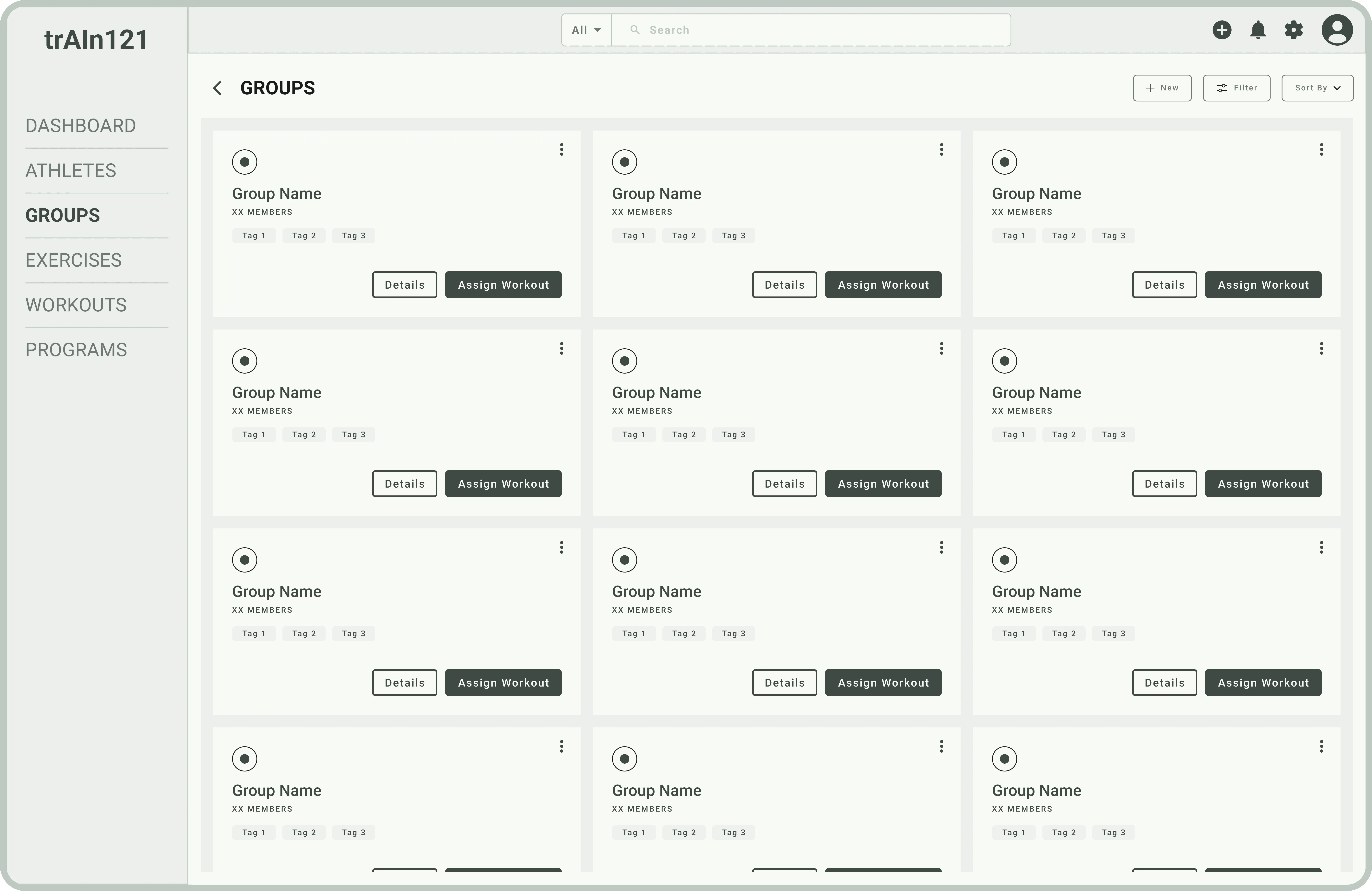
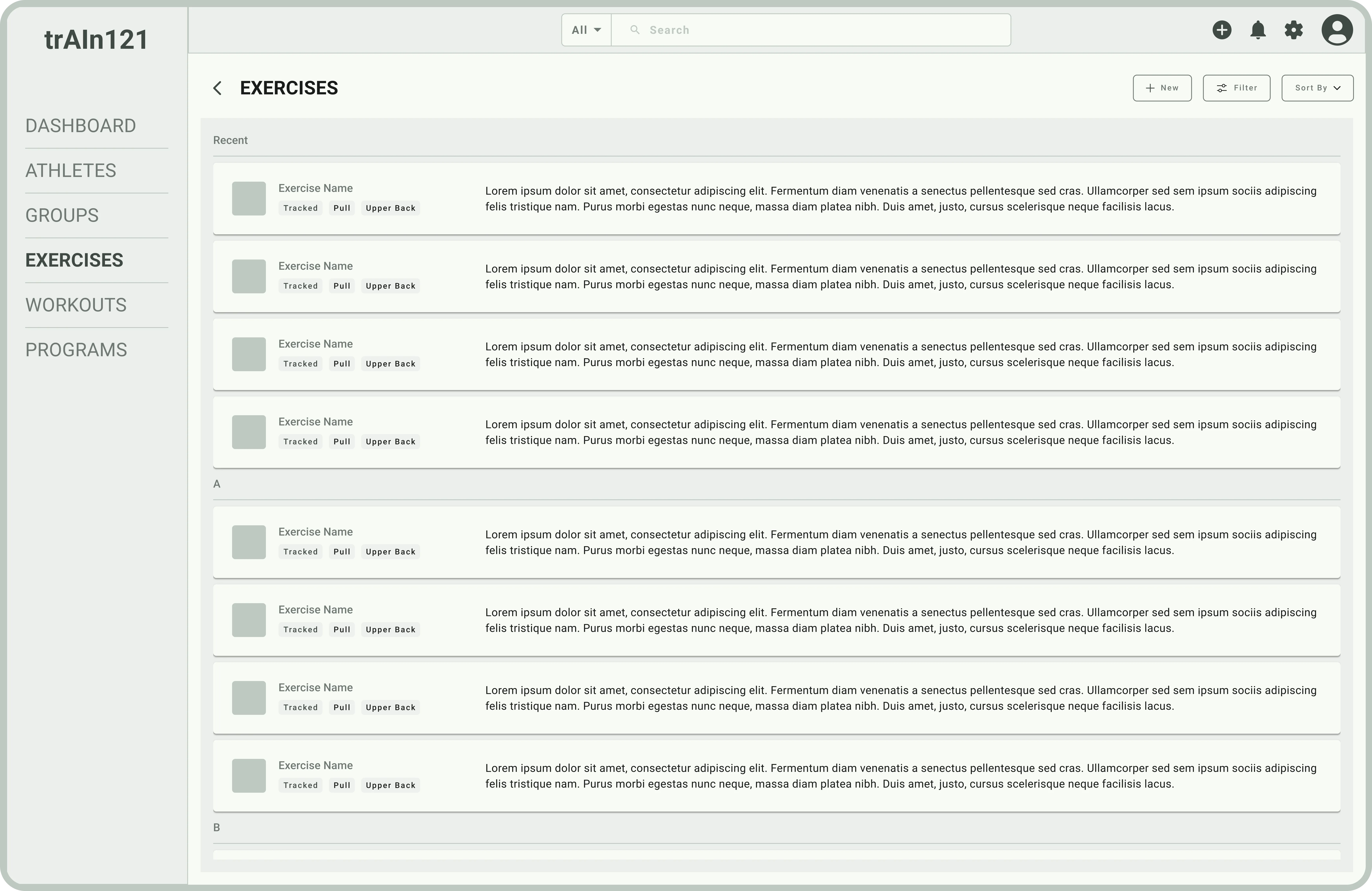
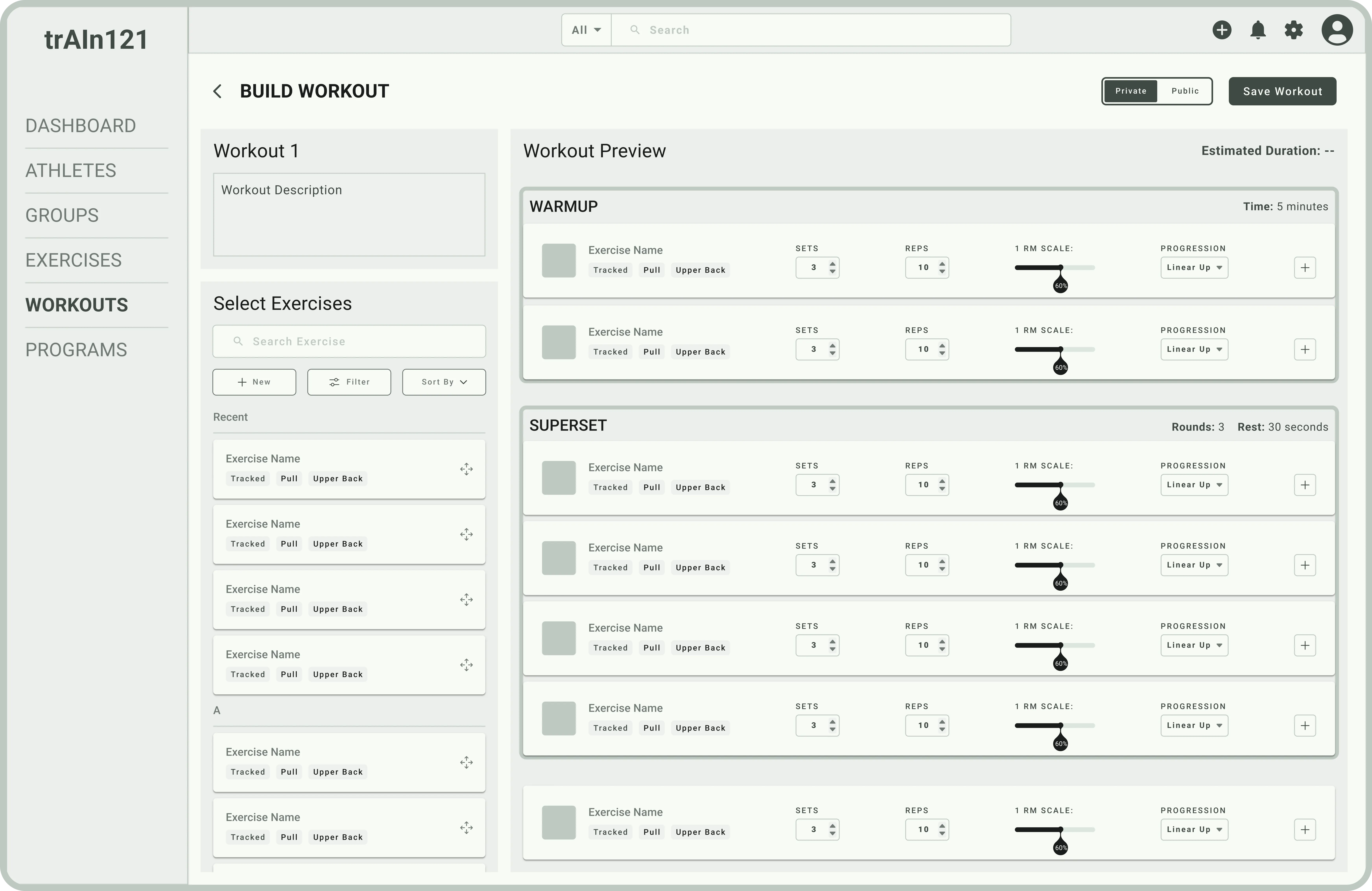
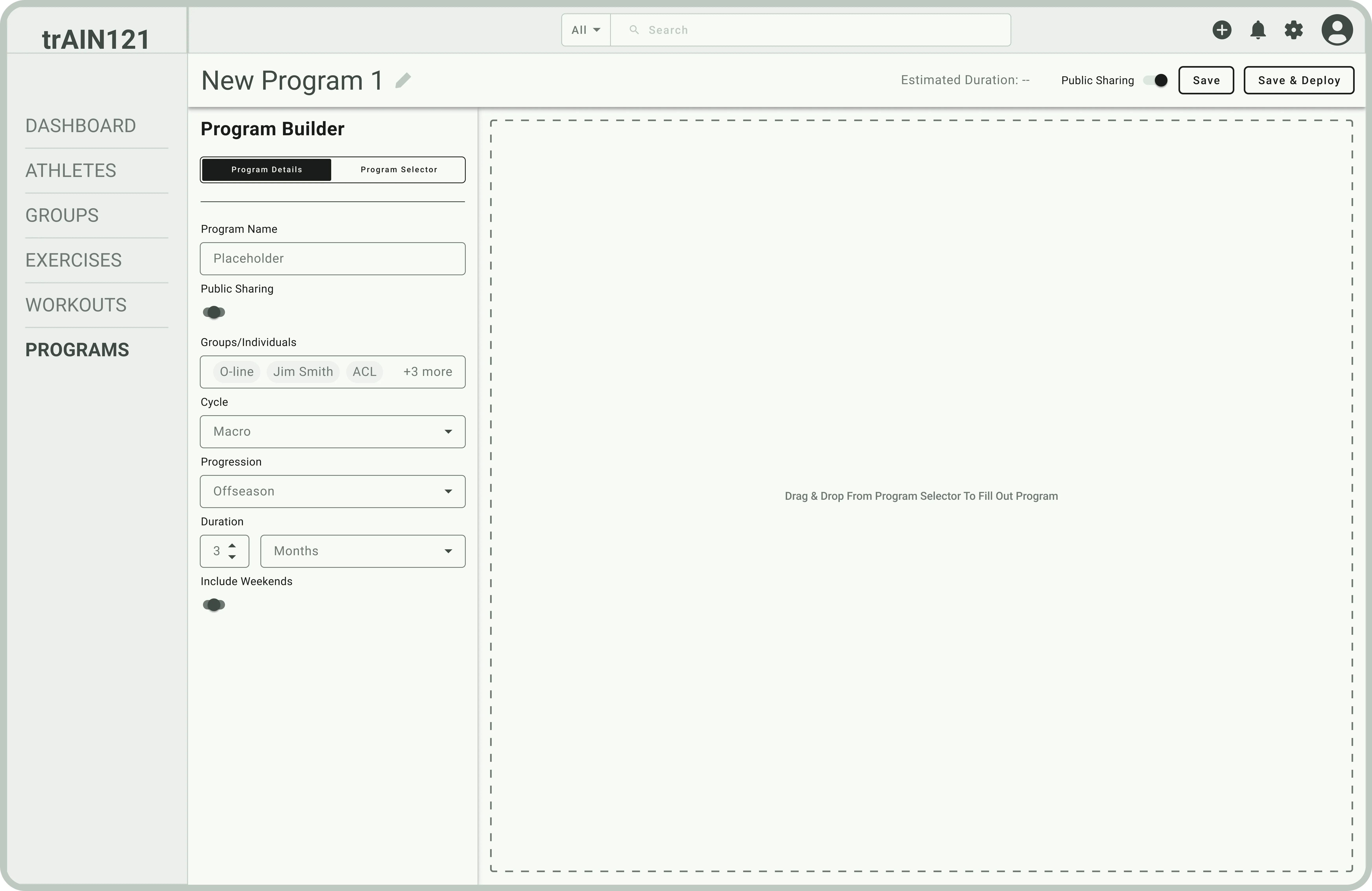
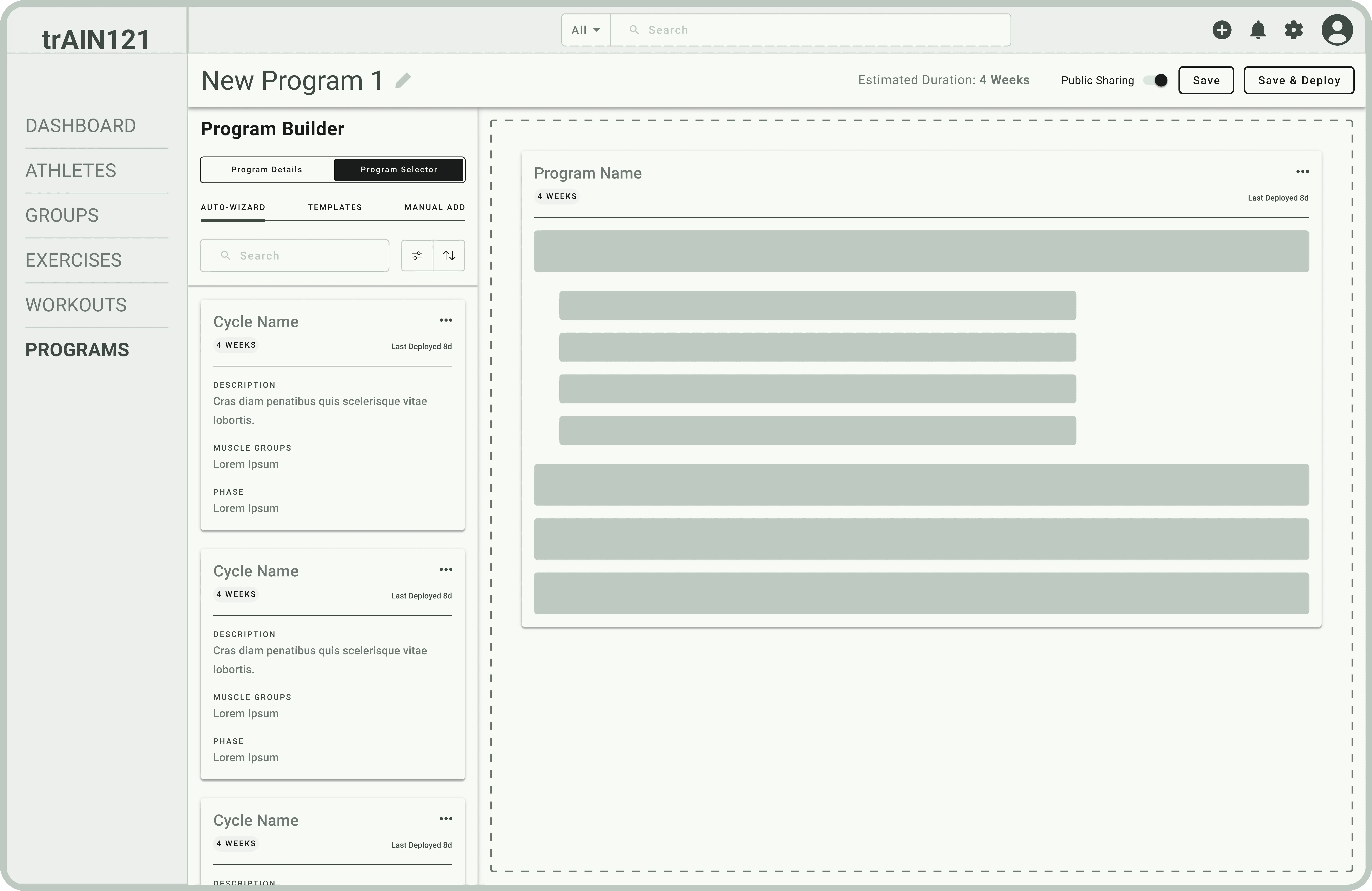
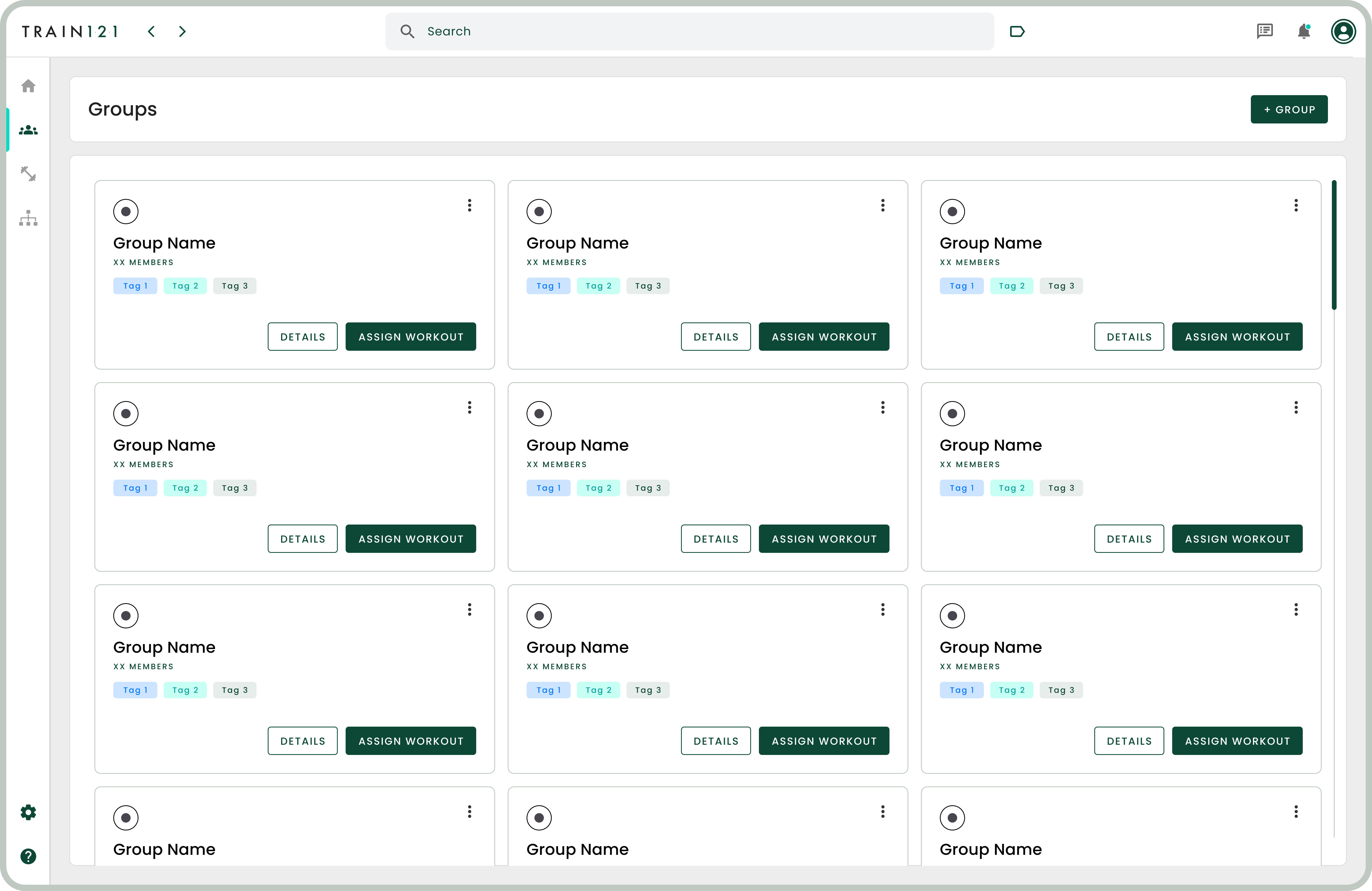
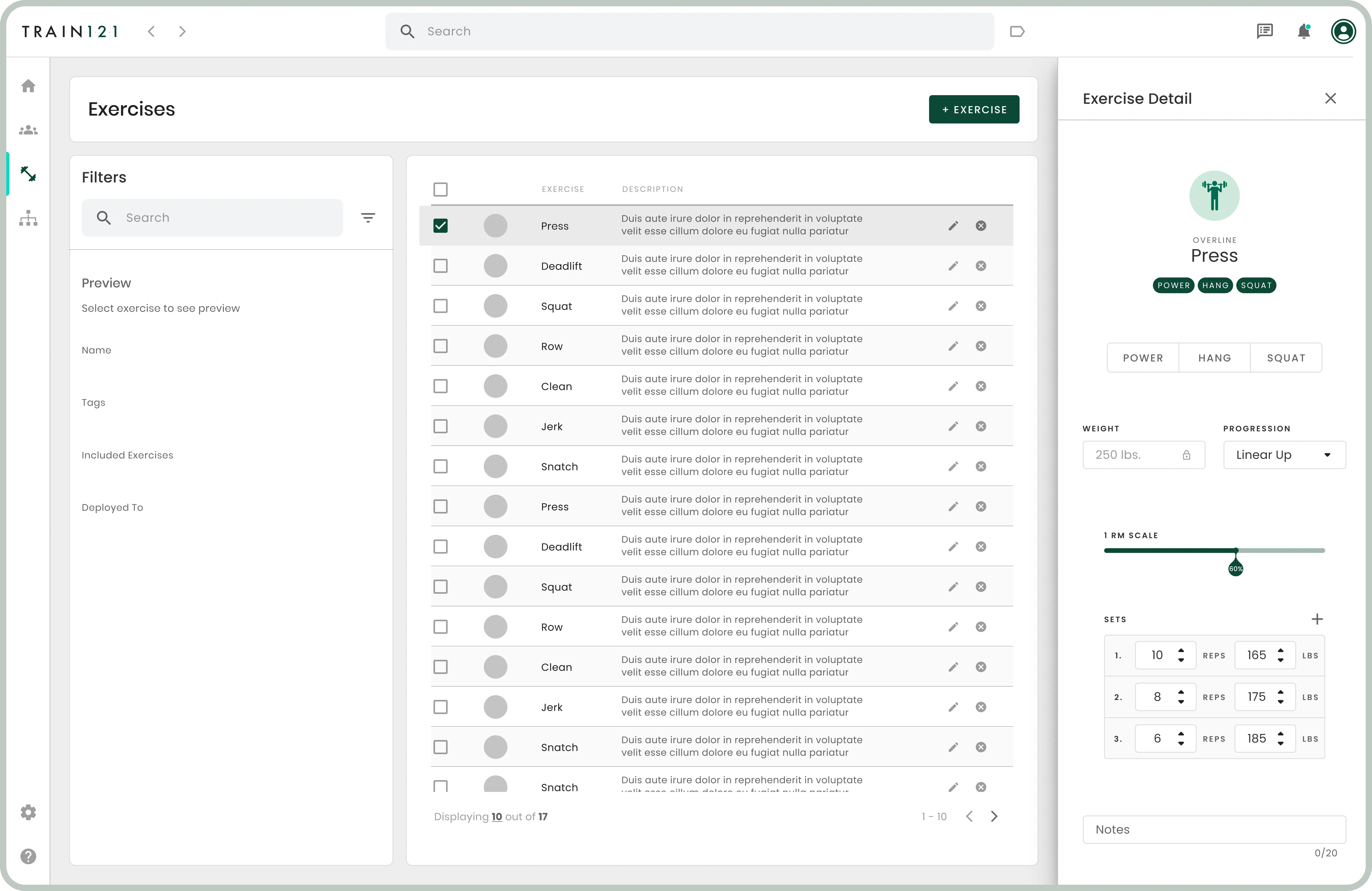
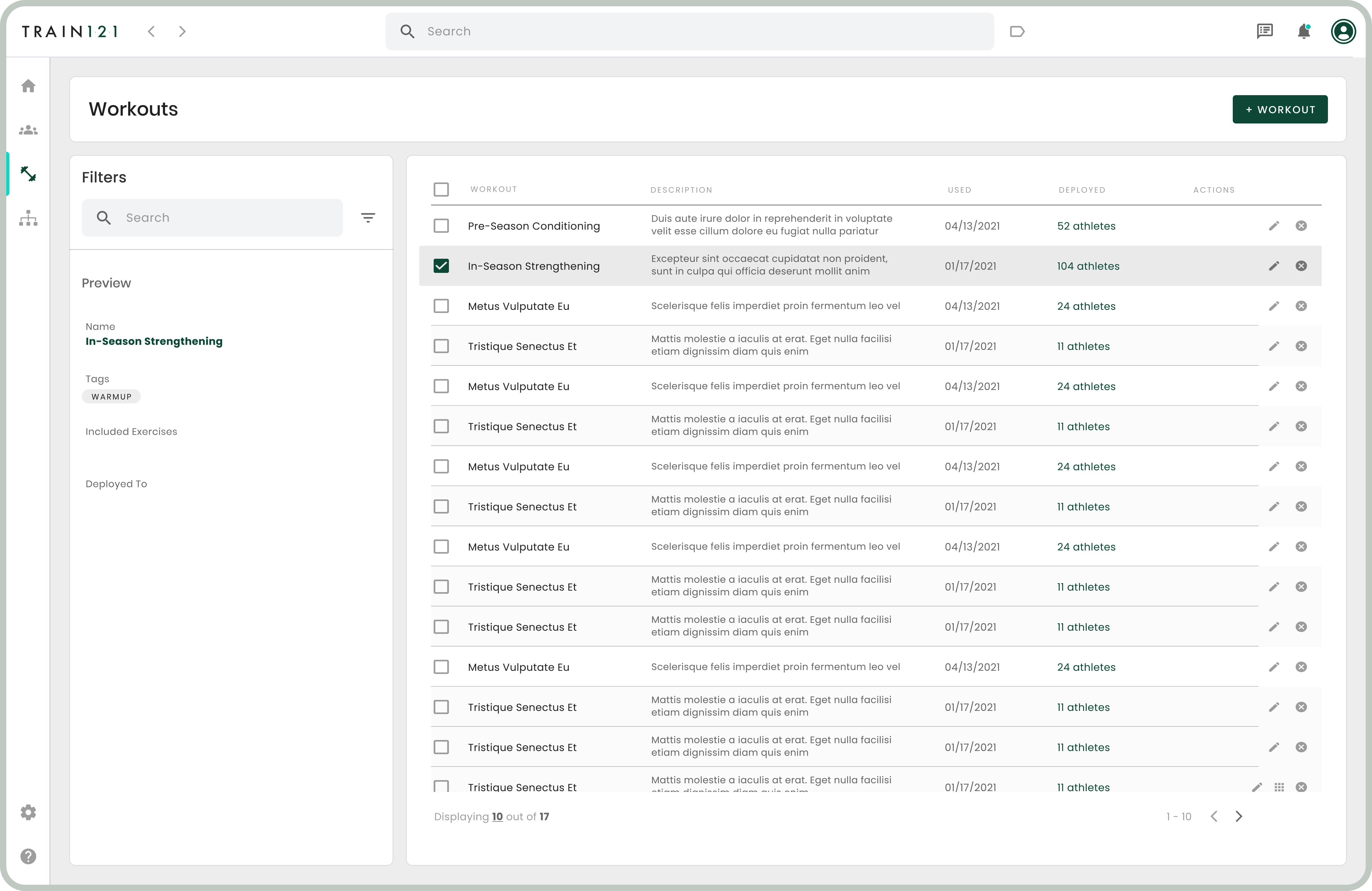
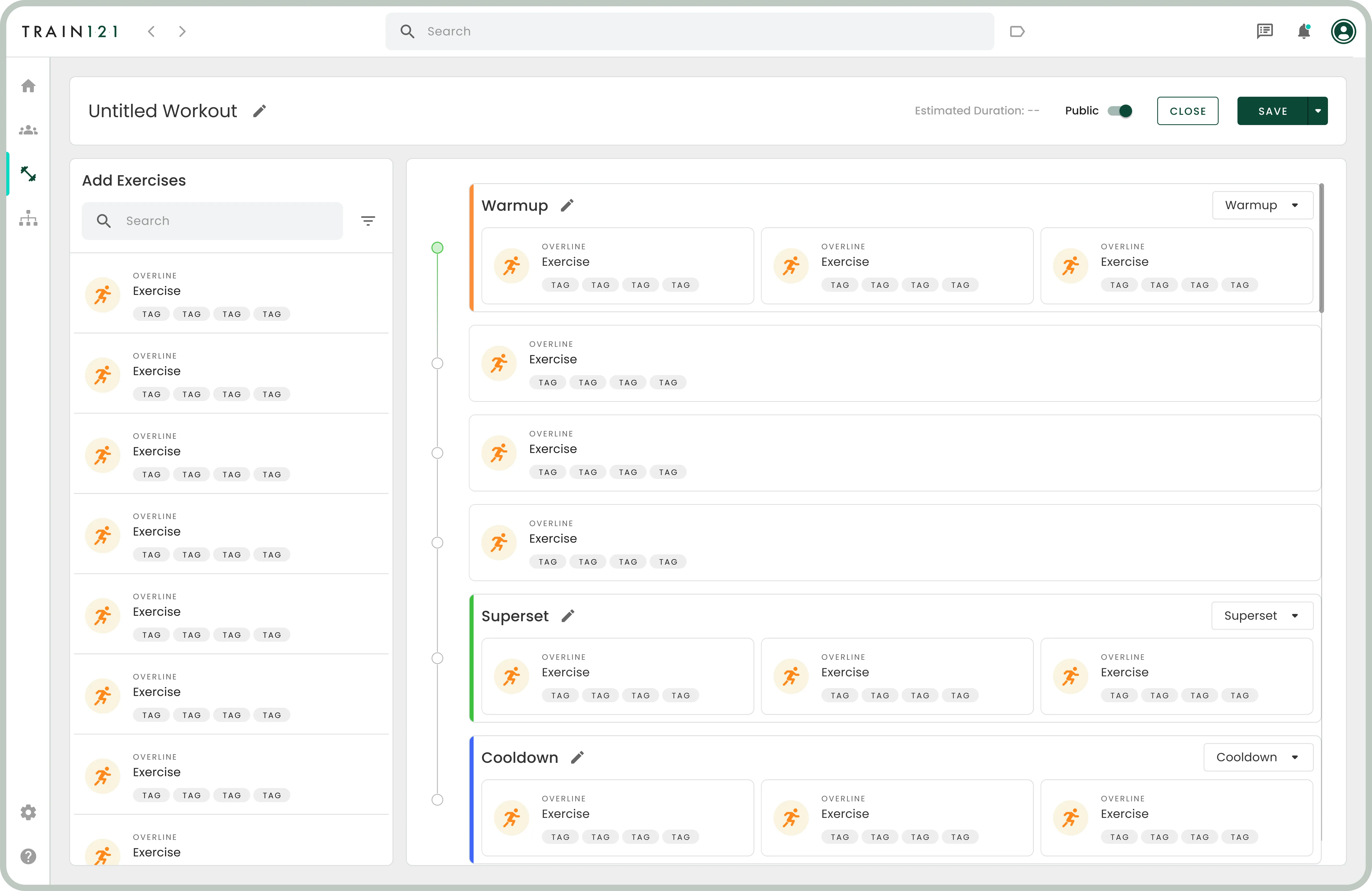
I started with initial sketches and moved on to more detailed wireframes. By the end of this phase, I had developed a clickable low-fidelity prototype. My design focus was on ensuring discoverability, clarity, and hierarchy in the user interface.
Feedback & Refinement
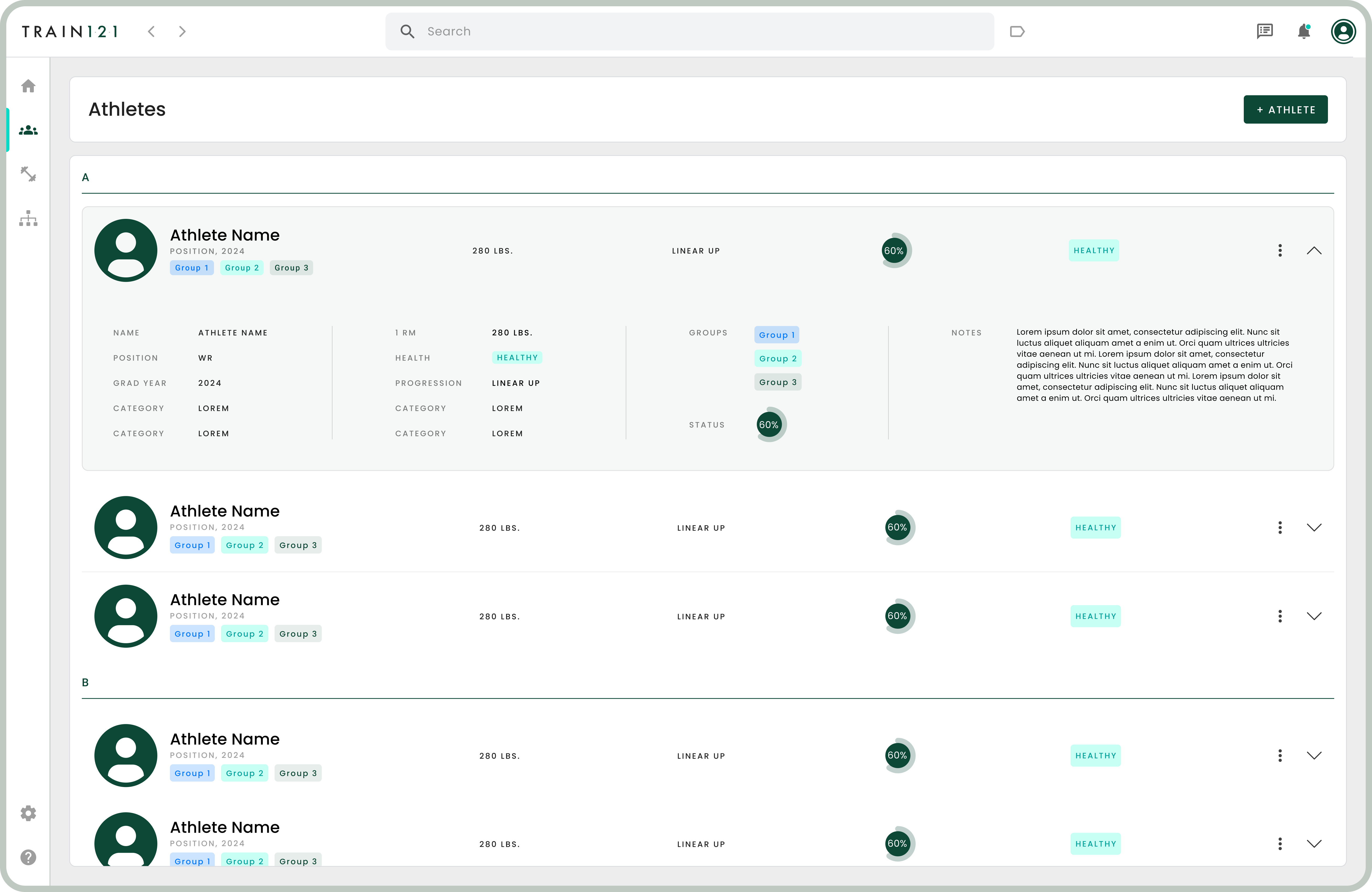
We made iterative improvements using feedback from usability tests. I then developed a polished, high-fidelity prototype using Figma. This included defining the UI kit, color schemes, typography, and other visual elements.
Handoff to Engineering
For a smooth transition to the development phase, I used Zeplin to hand off all the design specifications to the engineering team.
Crossing the finish line
Results
Preliminary reports from the coaching staff were positive, noting that the tool was easy to use and saved them time. Overall, the feedback was overwhelmingly positive, with users praising the modern, clean interface and user-friendly navigation.
