alternate_email
Get in touch
close
alternate_email
dark_mode
light_mode
Switch to dark mode
Switch to light mode
StartupOS
Summer 2022

StartupOS

Designing an MVP for a Learning-Centric Startup Accelerator
Overview

Making Startup Success More Attainable

Organization
StartupOS
My Role
Co-Lead Product Designer – UX Design, UI Design, Prototyping, Interaction Design, Content Design, Visual Design, IA, Strategy, Research, Testing
Timeline and Status
5 Months – Launched Summer 2022
The Goal
The overarching goal of this project was to create a minimum viable product (MVP) within a 5-month timeframe that aimed to help first-time founders craft investor-ready pitch decks, with a specific focus on designing Learning Paths that contain Learning Units.

This case study will focus specifically on designing the Learning Paths and the Learning Units used to help the founders reach their goal.
The Problem

Emotional & Practical Roadblocks

The hurdles holding back founders

Early-stage founders often face a lack of structured guidance and resources, leading to difficulties in successfully pitching to investors. The lack of an organized, step-by-step approach only makes the challenges more difficult, including emotional and practical roadblocks, that founders face when turning a vision into a viable startup.

sentiment_dissatisfied
Guidance Gap
Often don't know how to create a compelling pitch deck.
sentiment_dissatisfied
Resource Scarcity
Limited access to investor engagement opportunities.
sentiment_dissatisfied
Knowledge Void
Unaware of what investors actually look for.
sentiment_satisfied
The Solution
Design a learning path that offers a step-by-step roadmap to equip early-stage founders with the knowledge, skills, and artifacts they need to confidently pitch to investors.
Project Timeline
experiment
Research
Interviews, define user types/journeys.
checklist
Define
Pain points, challenges, feature set.
design_services
Ideate & Design
Develop user flows, low to mid-fidelity designs, clickable prototypes, & hi-fidelity designs.
sticky_note
Content Writing & Copywriting
Create content & copy for platform pages & learning modules.
repeat
Prototyping, Testing, & Feedback
Conduct monthly demos, gather feedback, test, & iterate.
code_blocks
Development Handoff & QA
Ensure precise communication and quality implementation during development.
Month 1
Month 2
Month 3
Month 4
Month 5
User Type & Journey Design
Review/define user types & journeys.
Feature Set Definition
Define feature set for each user journey.
UX/UI Development
Develop user flows, low to mid-fidelity designs, clickable prototypes, & hi-fidelity designs.
Content Writing & Copywriting
Create content & copy for platform pages & learning modules.
Prototyping, Testing, & Feedback
Conduct monthly demos, gather feedback, test, & iterate.
Development Handoff & QA
Ensure precise communication and quality implementation during development.
2.0
Project Timeline & Tasks
Diagram
Audience

Startup Founders

Seeking guidance & validation

While our broader platform serves a varied user base, Learning Paths are designed for founders in particular. These founders are hopeful but overwhelmed, eager to pitch but uncertain about where to begin.

rocket_launch
Excited but overwhelmed. New to the world of startup pitching.
indeterminate_question_box
Need direction and guidance. Unsure about what steps to take.
verified
Seek validation and feedback. Looking to test and validate their business ideas.
format_quote

Straight from the source

"I'm afraid there are things that I think I know but I don't know."
Experienced Founder
"Having someone who had been through the ride was valuable for my own sanity, let alone decision making."
Experienced Founder
"As a founder, you are juggling a lot of things that you really don't know much about."
Experienced Founder
"I have infinitely less access to the startup network since I am not in the Bay Area."
Experienced Founder
"I might mess up with legal or tax, and this could have consequences."
Experienced Founder
"Fundraising is a very tense and difficult situation to build trust in."
Experienced Founder
"Most available tools for founders are just question and answer forms without much guidance."
First Time Founder
Process

Zooming In on Founder Success

Holistic View

Designing a Full-fledged Platform

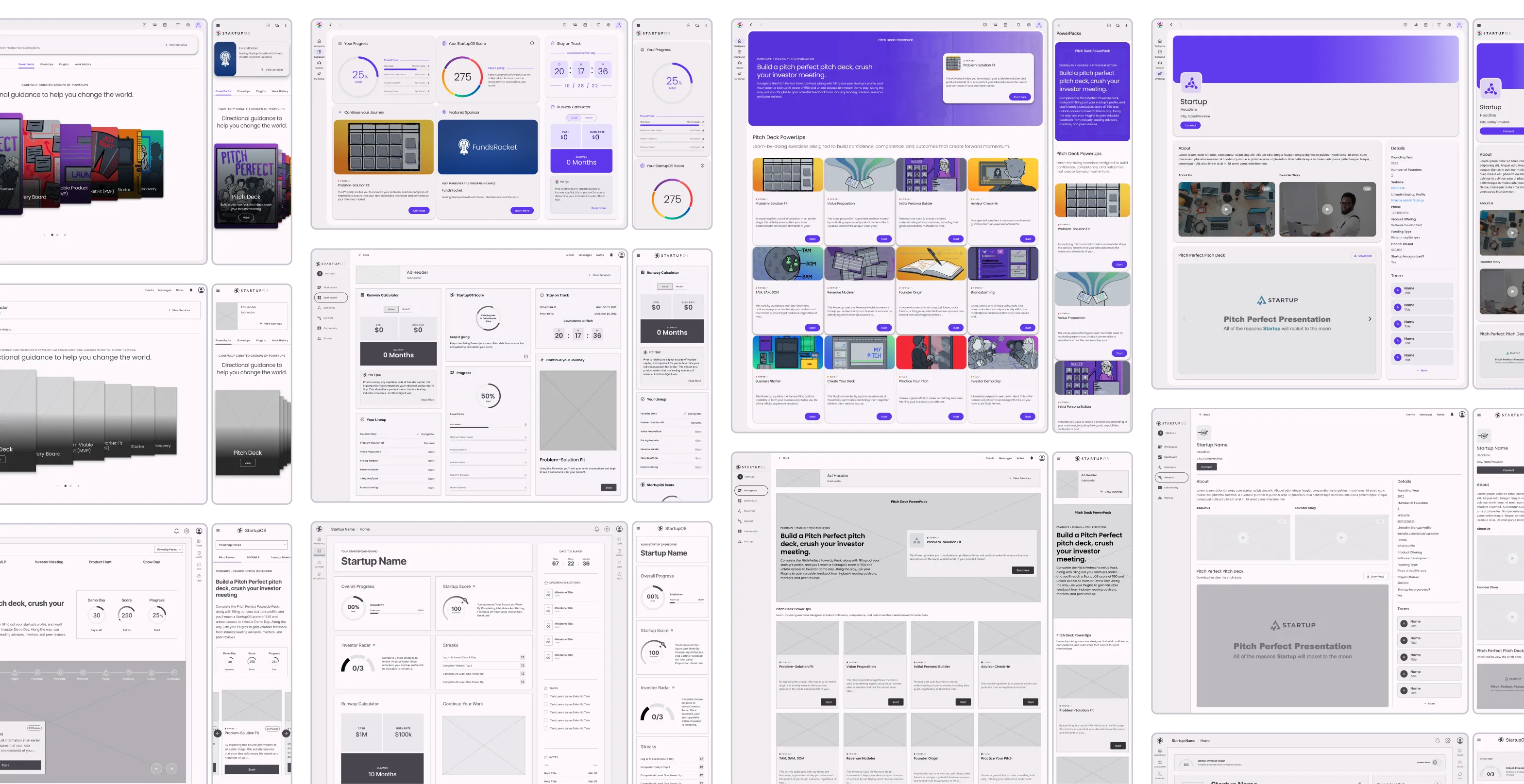
My role involved designing every aspect of StartupOS, addressing various user types such as founders, mentors, advisors, and investors. This included landing pages, dashboards, networking features, and more.

Broad sample of platform designs
4.0
Broad sample of platform designs
Image

Research & Analysis

We started with foundational steps like user stories to capture the needs and pain points of our target audience. We also conducted a competitive analysis to identify market gaps and opportunities, setting the stage for a user-centric design.

User Stories
As a first-time founder
I want to:
So I can:
Have access to a curated knowledge base of startup resources and guides
Quickly learn about essential aspects of starting a company
Utilize a platform that connects me with experienced mentors and advisors
Be guided through the startup journey
Have access to tools that helps me create a business plan and financial projections
Present a solid case to potential investors
Have access to a community forum
Ask questions, share experiences, and network with other entrepreneurs facing similar challenges
Have access to funding opportunities and investor connections
Secure the necessary capital for my startup
4.1
User stories
Table
Competitive Analysis
Brands
Strengths
Weaknesses
Y Combinator Logo
Y Combinator
Renowned startup accelerator with a strong track record of successful companies like Dropbox and Airbnb.
Highly selective, admitting only a limited number of startups each batch. Not all startups can access its resources.
Techstars Logo
Techstars
Offers a global network of accelerators, mentorship, and funding opportunities.
Similar to Y Combinator, it's highly competitive, and startups must go through a rigorous application process.
500 Startups Logo
500 Startups
Provides early-stage funding and a global network of mentors and investors.
While it has a wide reach, it still involves a competitive selection process and may not be accessible to all startups.
Seedcamp Logo
Seedcamp
Offers pre-seed and seed-stage funding, as well as a network of mentors and resources.
Like other accelerators, it has a selective application process, making it challenging for all startups to join.
StartupOS Logo
StartupOS
Tailored for startups, offering ready-made templates and guidance for crucial startup operations like business planning, financial projections, and investor relations.
Needs to build its user base and expand its template library to cover more startup scenarios. Doesn't offer direct funding or in-person mentorship like traditional accelerators do.
4.2
Competitive analysis
Table

User Persona & Journey

We designed with our target audience in mind, capturing the highs and lows of the founder's journey.

User Persona
Illustration of user persona
Name
Omar Patel
Age
26
Location
Des Moines, Iowa
Occupation
Aspiring Entrepreneur
"There's just so much information out there, it's tough to know what's reliable. I'm looking for step-by-step guidance I can trust to build my pitch and connect with the right people."
flare
Background
  • Holds a bachelor's degree in Anthropology.
  • Successfully ran a small online lifestyle blog with a decent following.
flare
Traits
  • Social butterfly, great at networking but new to the startup world.
  • Trusting and optimistic, open to new experiences and ideas.
flare
Needs
  • Expert guidance on startup pitching.
  • Step-by-step instructions for creating a pitch deck.
  • Networking opportunities with advisors and investors.
flare
Pain Points
  • Overwhelmed by the sea of online resources, doesn't know what to trust.
  • Has a broad network but lacks connections in the startup ecosystem.
  • Wants to be cautious despite enthusiasm, doesn't want to make rookie mistakes.
flare
Mindset
  • Eager to learn but overwhelmed.
  • Seeking trustworthy, reliable resources.
  • Approachable and keen on teamwork but needs focused guidance.
flare
Goals
  • Gain the foundational knowledge to turn a good idea into a viable business.
  • Network with the right people who can guide the startup journey.
  • Avoid getting lost in the sea of resources by finding a reliable mentor.
4.3
User persona
Diagram
User Journey Map
Discover
Signup & Onboard
Learning Path
Learning Units
Demo Day
Action
Searches for "how to create a startup pitch deck" online.
Chooses StartupOS and signs up.
Starts the Pitch Deck Learning Path.
Goes through each unit like "Finding Problem-Solution Fit", "Create a Persona", etc.
Presents pitch to investors on Demo Day.
Goals
Wants to find a one-stop solution.
Quick and easy signup.
To grasp the startup pitching fundamentals.
To gain skills required for each stage.
To get investment for their startup.
Feelings
Curious but overwhelmed with options.
Hopeful but cautious.
Excited but slightly anxious.
Engaged but may face confusion.
Nervous but prepared.
Pain Points
Could be overwhelmed with information overload; unclear credibility.
If there is a long onboarding questionnaire.
Initial uncertainty about the sequence and outcome.
If some units are harder than others and there's no quick help when you're stuck.
Anxiety about technical issues during presentation.
Opportunities
Provide clear introductory content targeted at first-time founders to address Omar's curiosity.
Streamlined onboarding with skip options; can return to complete.
Short video intro to Learning Path to outline sequence and expectations.
Built-in chat for instant expert help; clear difficulty level indicators.
Pre-demo tech check; backup plans laid out beforehand.
4.4
User journey map
Table

Tools & Frameworks

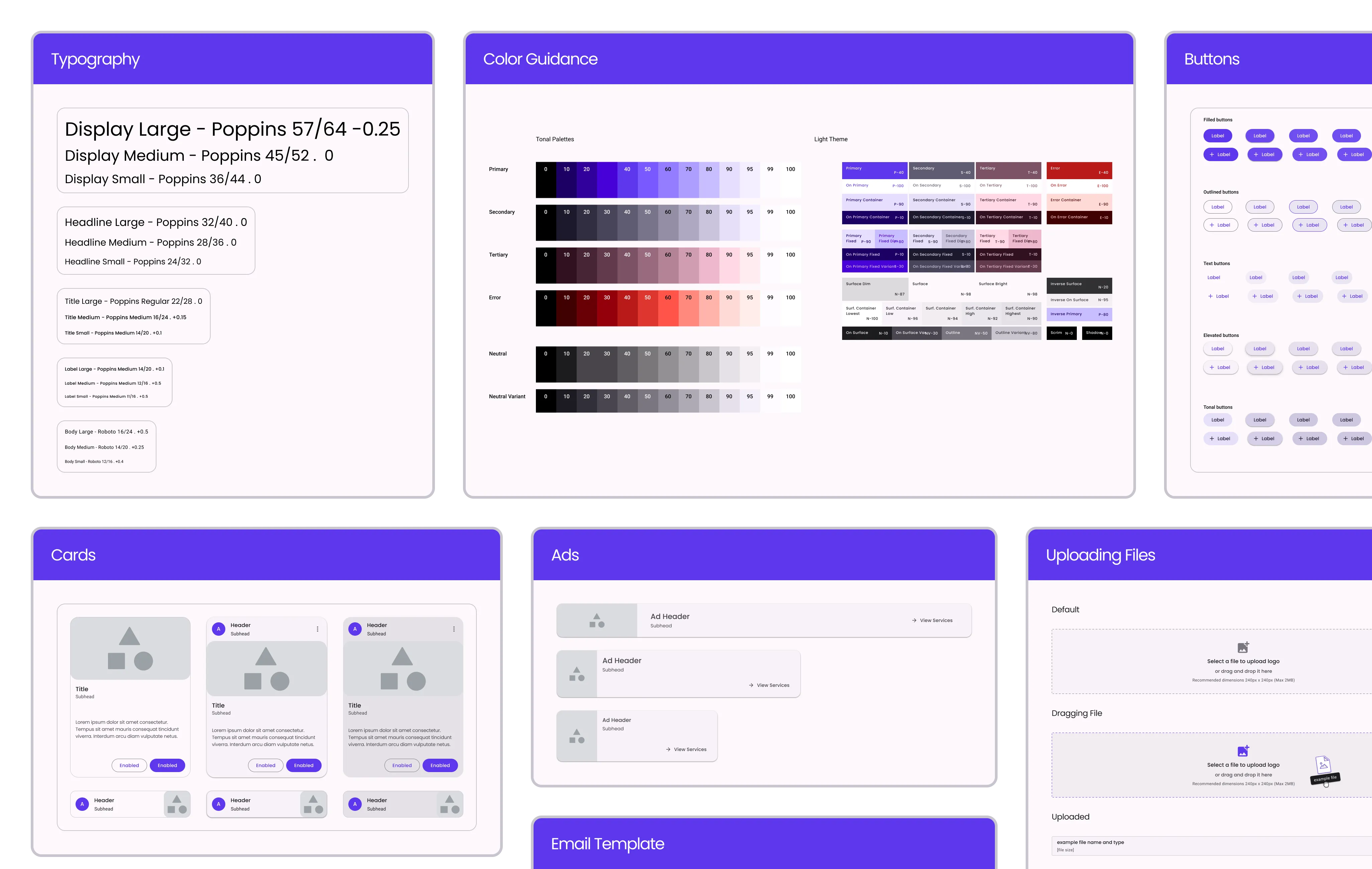
We used Google Material Design as our foundational UI framework and Figma as our design tool of choice. Jira was utilized to track the project’s status.

Styles & components
4.5
Styles & components
Image

The Foundational Feature

Curating Learning Paths for Founders

Learning Paths became the cornerstone of our product strategy and aimed to provide founders with a sequential learning journey. Specifically, the "Pitch Deck" Learning Path stood out as our answer to the founders' key pain point:

"How do I make a pitch deck that investors will love?"

The goal was to design a singular, impactful structure specifically focused on helping founders create an investor-ready pitch deck and culminating in a Pitch Demo Day.

Learning Paths
Curated roadmap to guide founders through specific areas like fundraising, marketing, or product development.
subdirectory_arrow_right
Learning Units
Combo of theory (Modules) and practice (Projects) that culminates in a pitch-deck-ready artifact.
subdirectory_arrow_right
Modules
Bite-sized lessons to grasp essential concepts.
subdirectory_arrow_right
Projects
Practical exercises that produce artifacts like market research data, business models, or design mock-ups, which can be directly incorporated into a pitch deck.
4.6
Learning path structure
Diagram

The "Pitch Deck" Sequence & Dependencies

Our first Learning Path was structured to guide founders step-by-step in their quest to get investor-ready. This wasn't a random assortment of modules; each Learning Unit was strategically sequenced to provide value and prepare founders for the subsequent stages.

Problem-Solution Fit
add
Description
The foundation. Before anything else, founders need to identify a problem worth solving and have a viable solution.
Dependency
Need to have an idea.
arrow_drop_down
arrow_drop_down
Value Proposition
add
Description
Builds on the first unit. It's not just about having a solution, but one that adds value to users.
Dependency
Value proposition guides persona creation.
arrow_drop_down
arrow_drop_down
Create a Persona
add
Description
A pivot towards the user. You have a valuable solution, but who will use it?
Dependency
Value proposition guides persona creation.
arrow_drop_down
arrow_drop_down
Advisor Feedback Session
add
Description
Time to validate your assumptions.
Dependency
Must have a problem, solution, value prop, and persona outlined to receive effective advice.
arrow_drop_down
arrow_drop_down
TAM SAM SOM
add
Description
Market size assessment.
Dependency
First four learning units needed to estimate market sizes accurately.
arrow_drop_down
arrow_drop_down
Revenue Model
add
Description
Now, how do you make money?
Dependency
Must know TAM SAM SOM to build a realistic revenue model.
arrow_drop_down
arrow_drop_down
Startup Narrative
add
Description
Time to weave everything into a cohesive story.
Dependency
All previous units feed into your narrative.
arrow_drop_down
arrow_drop_down
Startup Brand
add
Description
With your narrative in place, you can now define how it looks and feels.
Dependency
Startup Narrative gives the brand context.
arrow_drop_down
arrow_drop_down
Final Pitch Deck
add
Description
Compile all the assets. Each preceding unit has essentially been a building block for this pitch deck.
Dependency
Requires all previous artifacts and knowledge.
arrow_drop_down
arrow_drop_down
Pitch Deck Practice Session
add
Description
Fine-tuning with an advisor.
Dependency
Must have a complete draft of the pitch deck.
arrow_drop_down
arrow_drop_down
Investor Demo Day
add
Description
The final act, pitching to investors.
Dependency
Practice makes perfect; must complete the practice session first.

Work Smarter, Not Harder

A Templated Learning Unit Structure

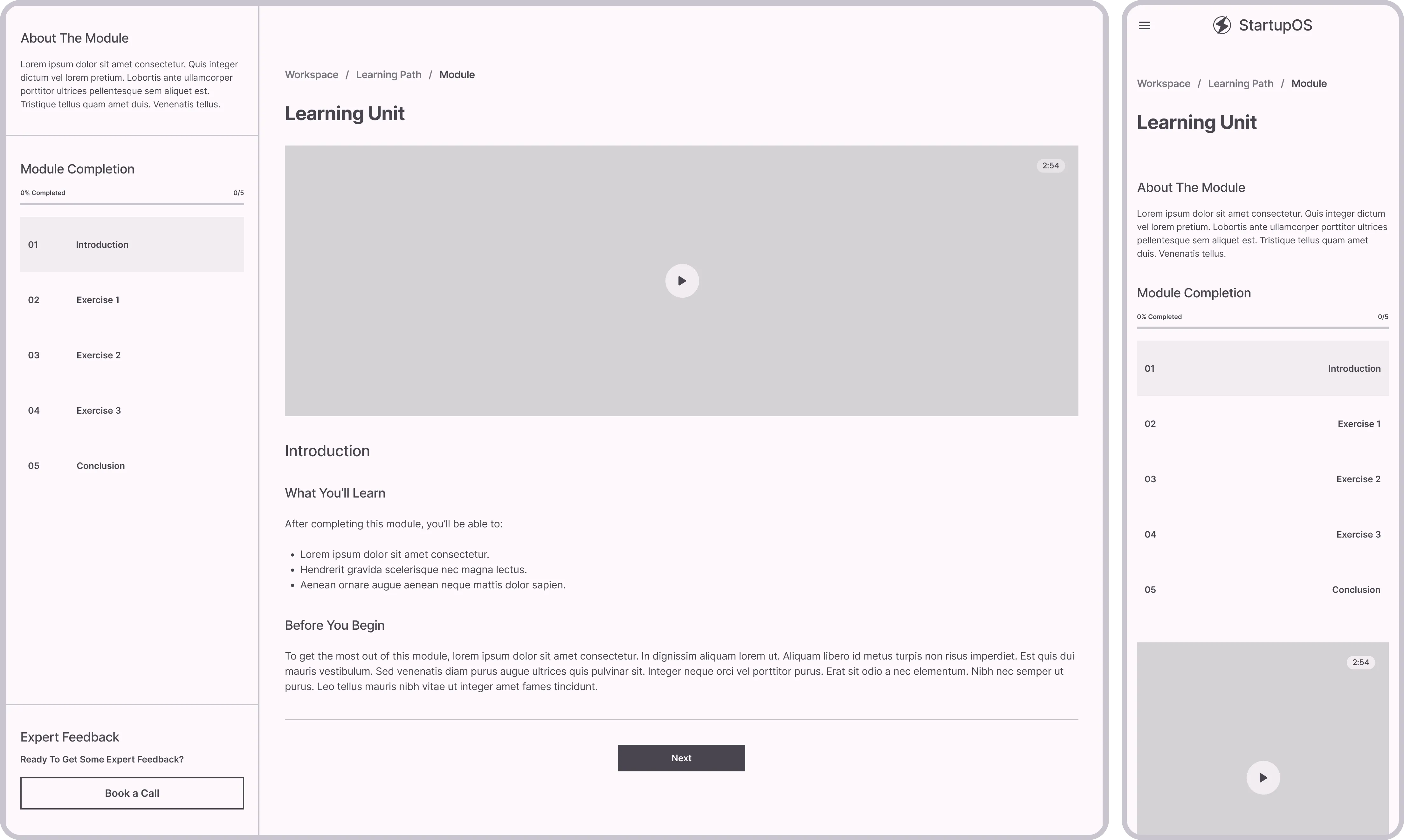
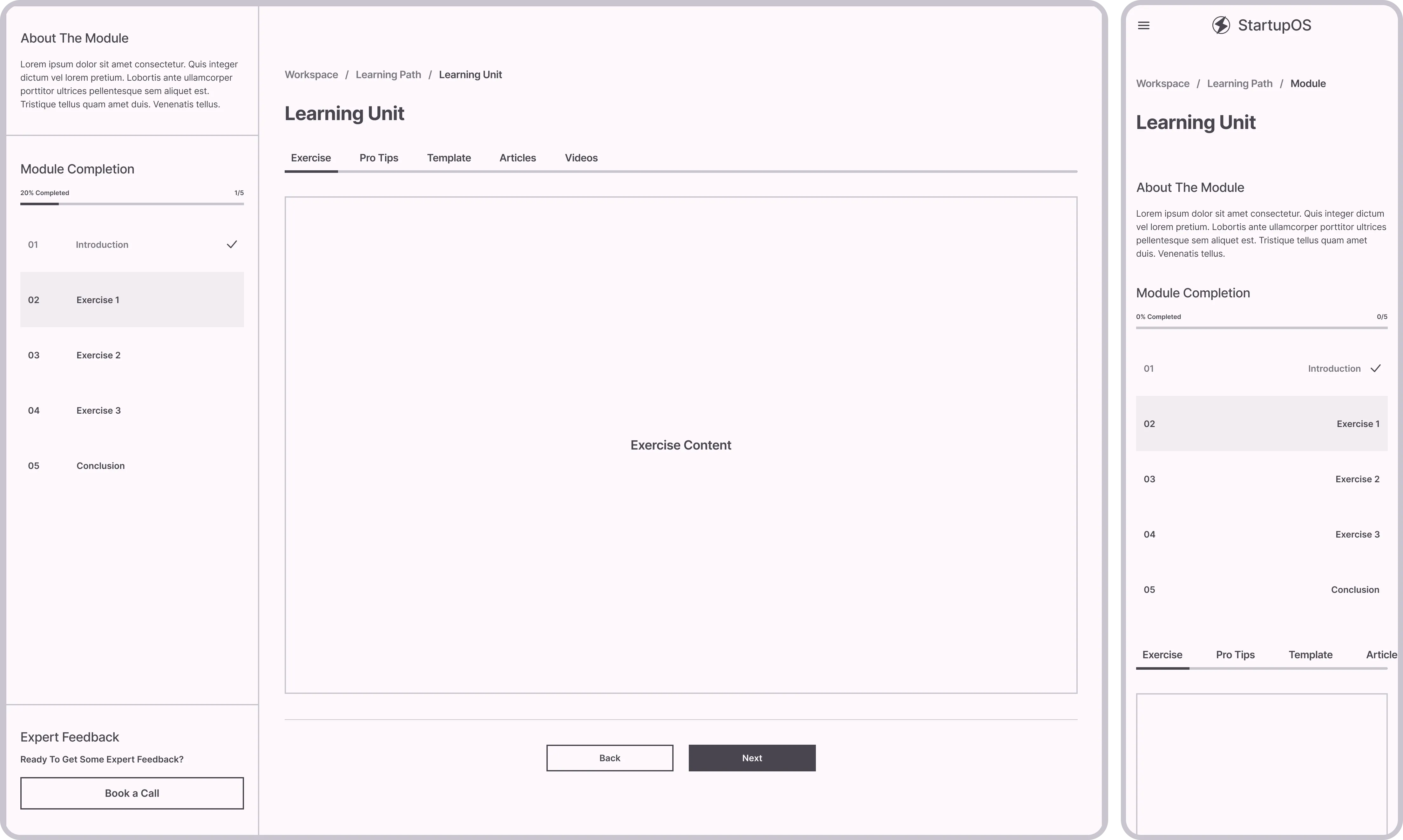
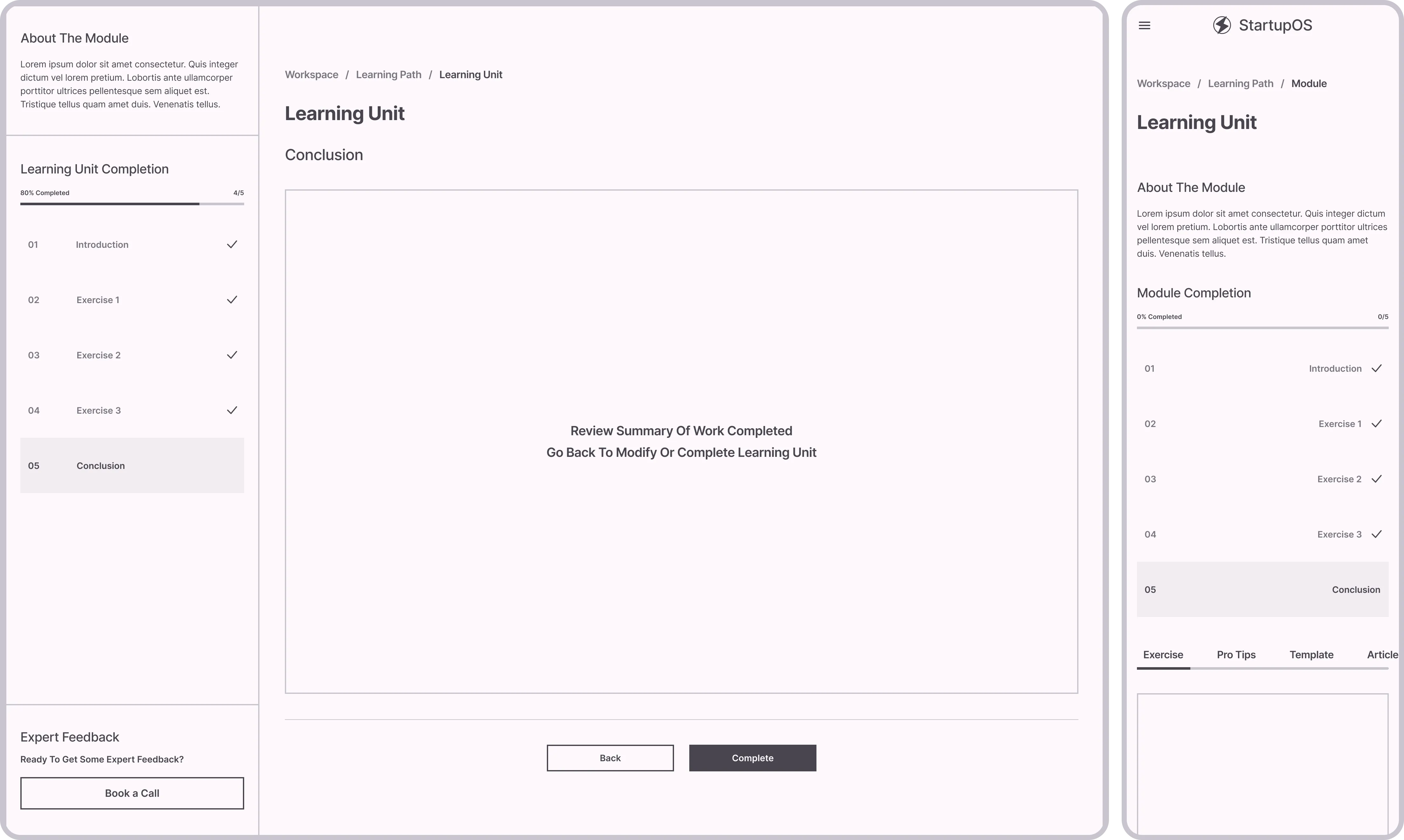
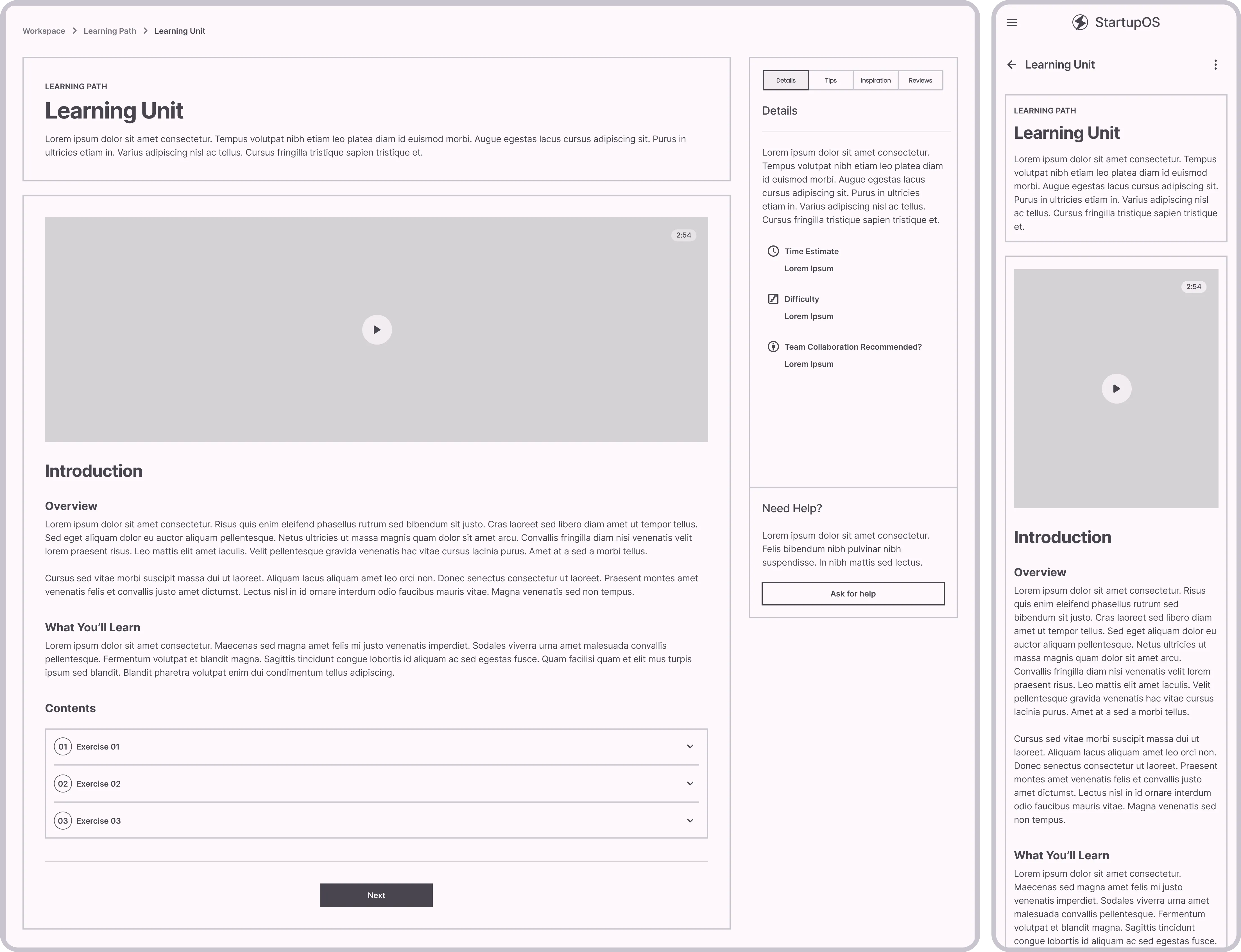
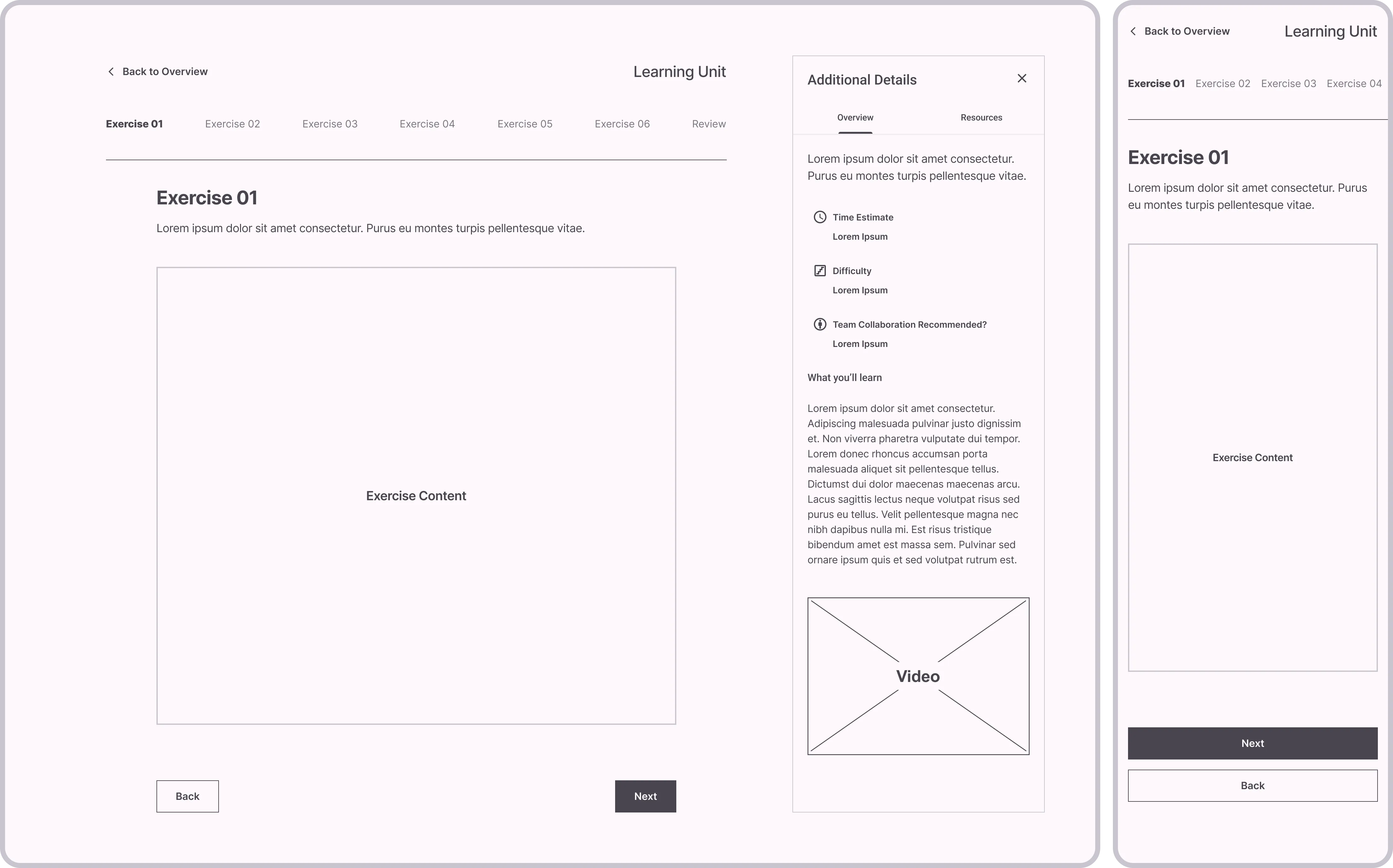
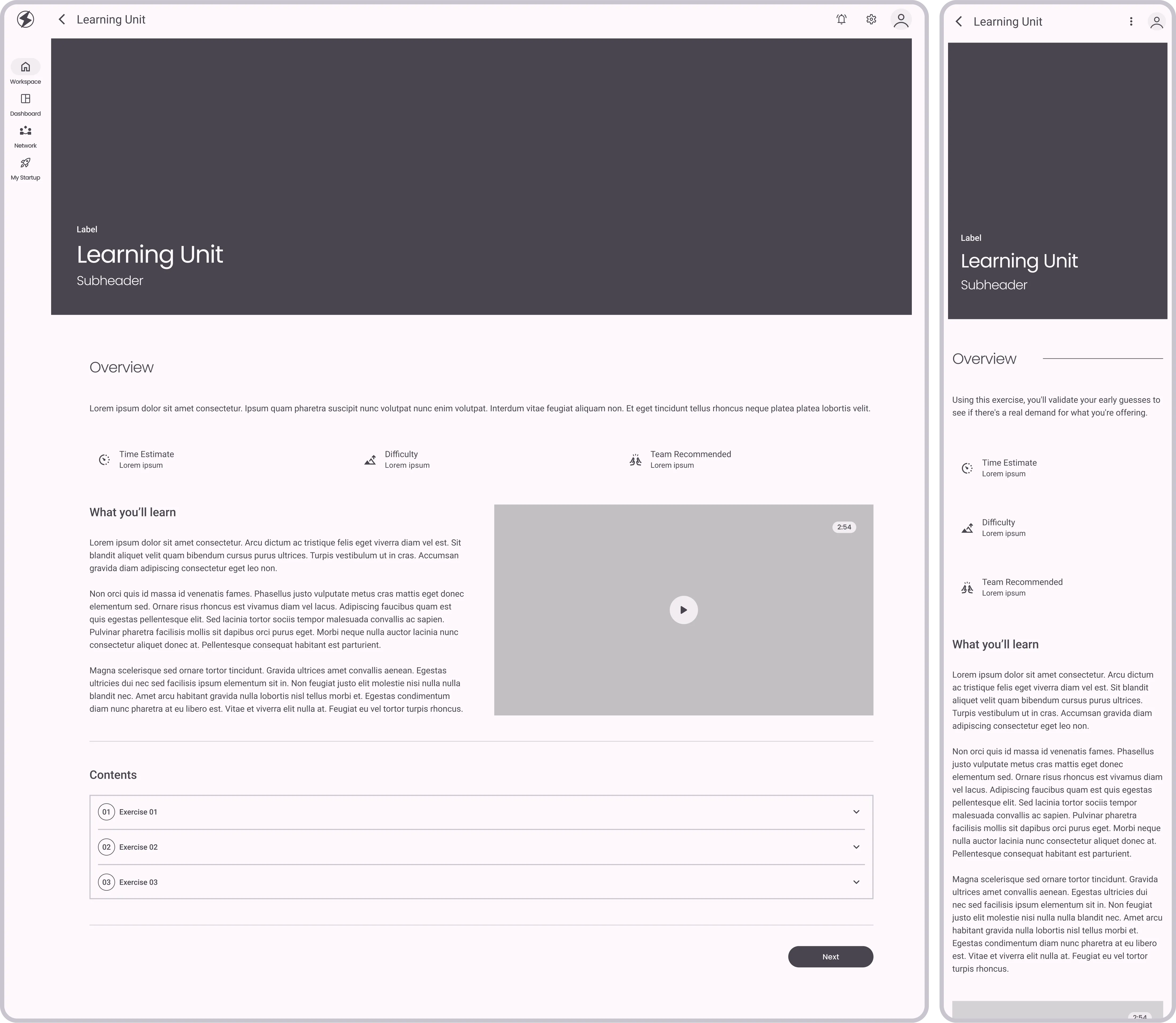
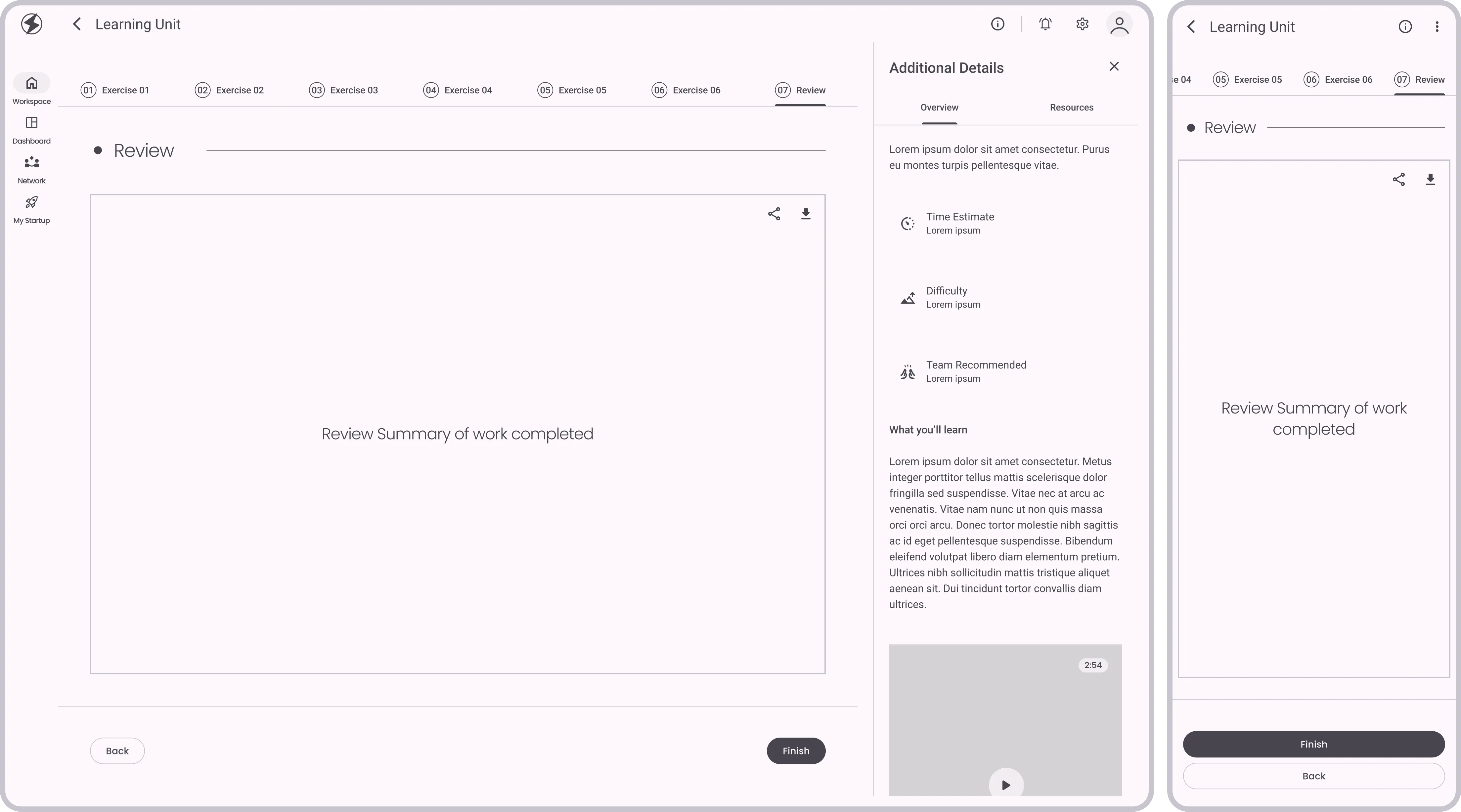
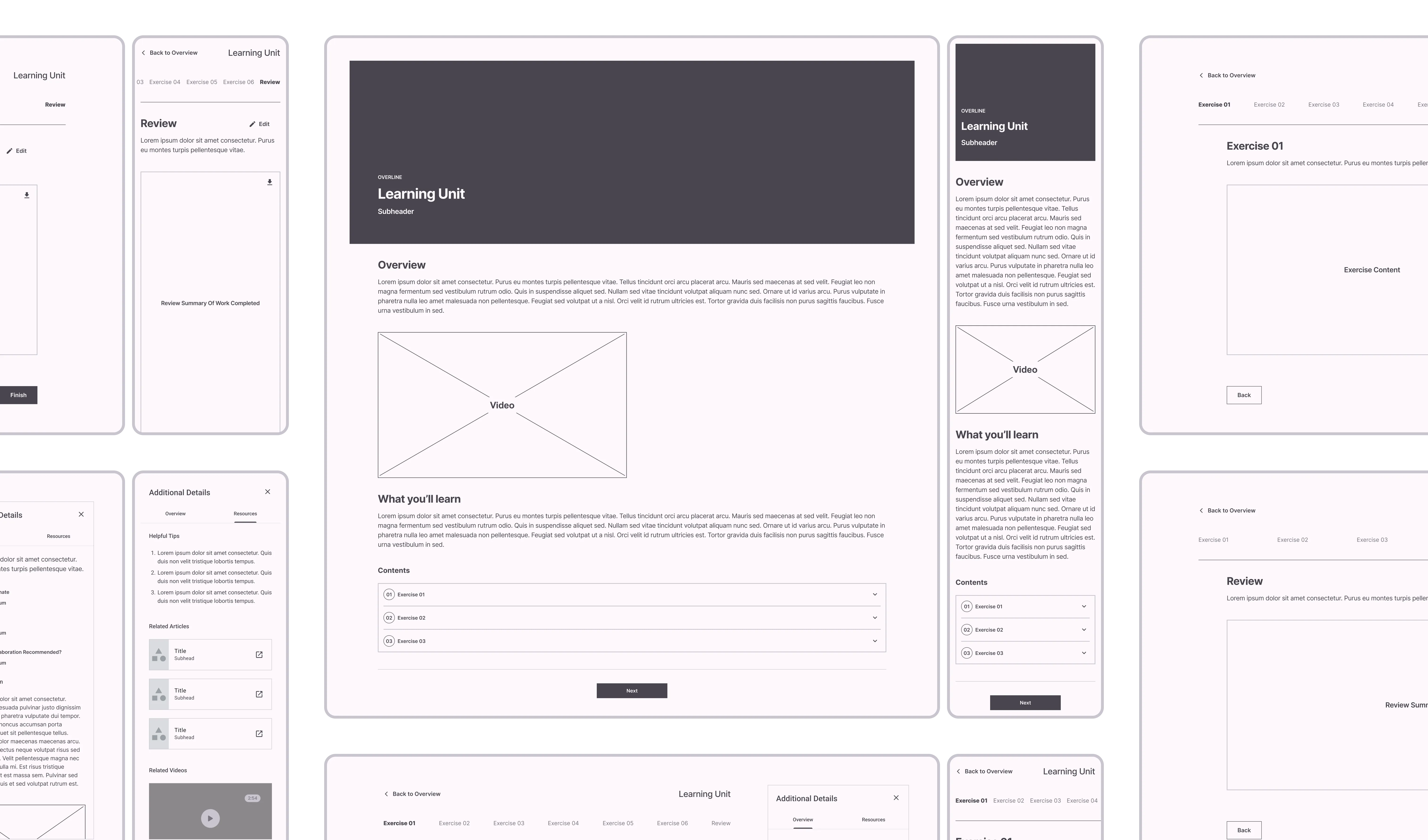
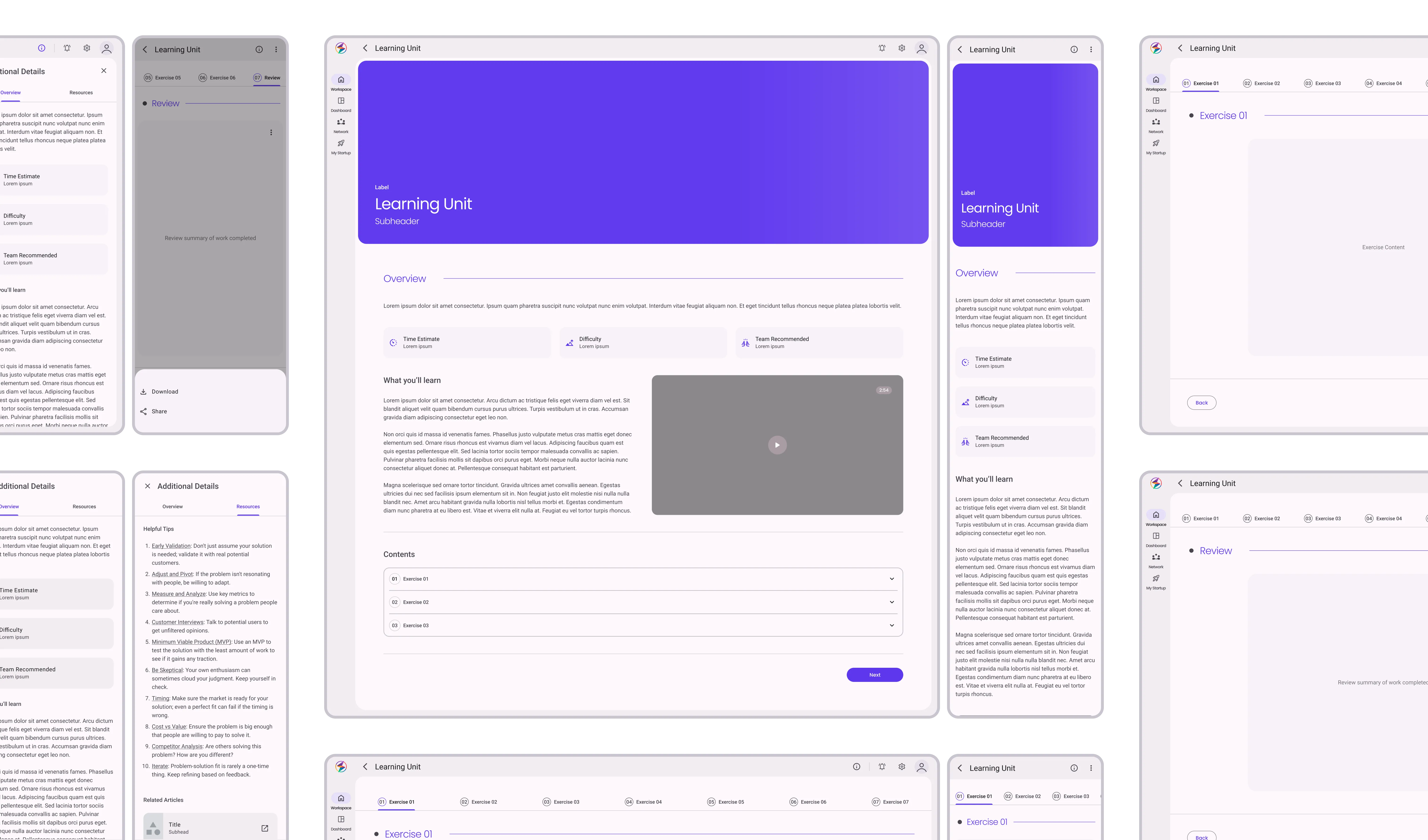
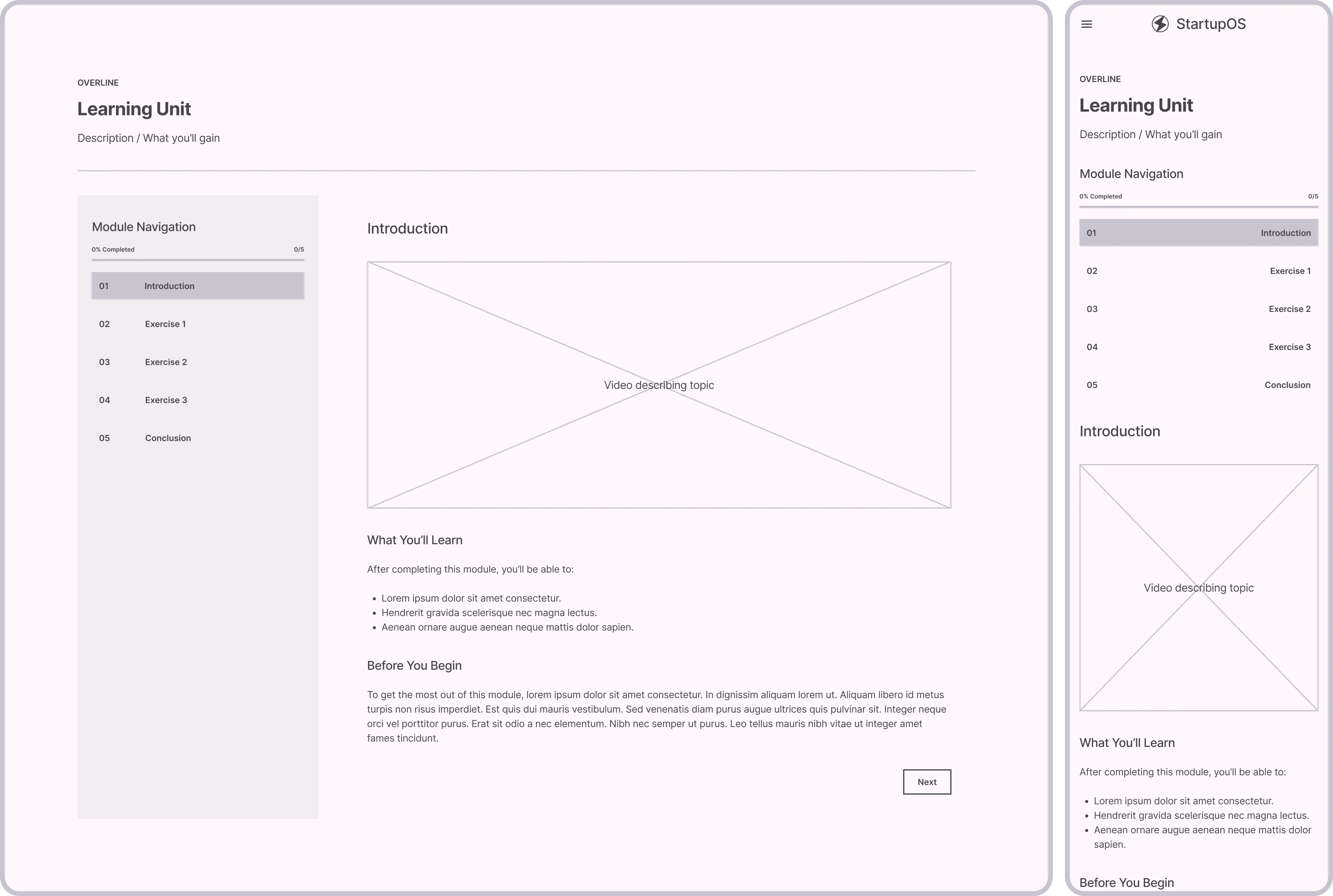
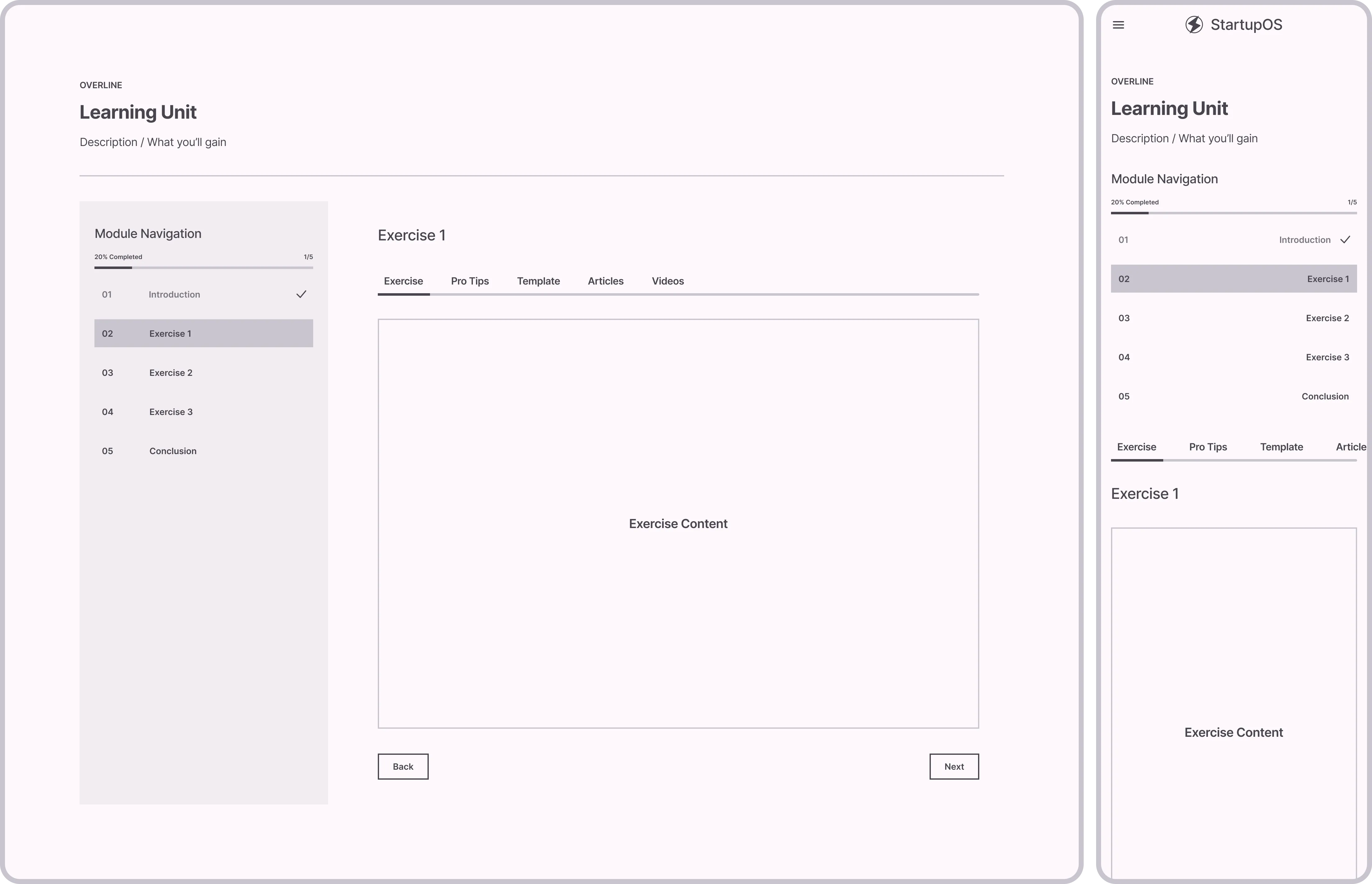
In designing Learning Units, we used a reusable template to speed up creation, enhance scalability, and ensure a consistent look and feel. Starting with low-fidelity wireframes, multiple iterations were made based on user feedback to reach the final design.

View Static Images
Before
Learning unit template design (Before & After)
After
Learning unit template design (Before & After)
sync_alt
4.7
Learning unit template design (Before & After)
Interactive
Learning unit template design (Before)
4.7.A
Learning unit template design (Before)
Image
arrow_downward
arrow_right_alt
Learning unit template design (After)
4.7.B
Learning unit template design (After)
Image

Design & Copy: Beating the Clock

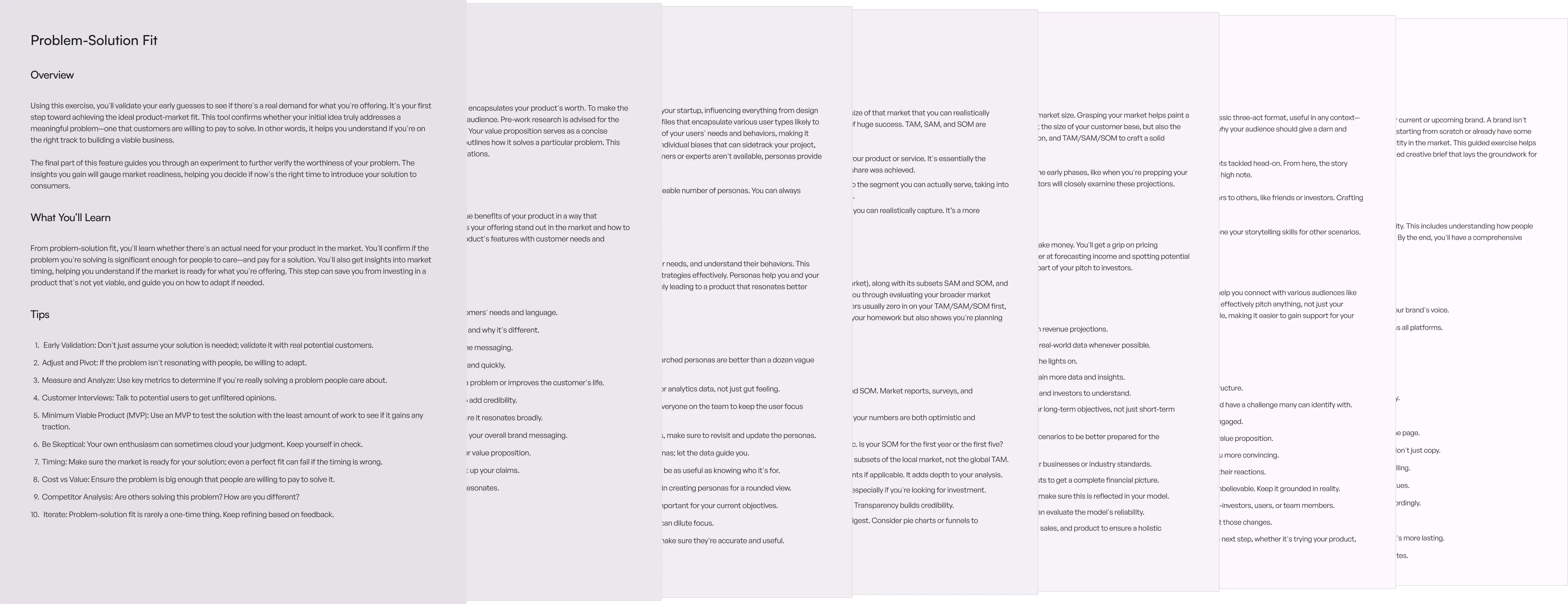
Juggling multiple roles, we not only focused on design but also took on copywriting tasks. This was especially challenging given the aggressive deadline, but we overcame it by prioritizing tasks and closely collaborating to ensure quality and timeliness.

The eventual hiring of a dedicated Content Designer was a turning point; it freed us to focus more on design aspects.

Sample of content & copywriting
4.8
Sample of content & copywriting
Image

Getting Specific

Designing the first Learning Path

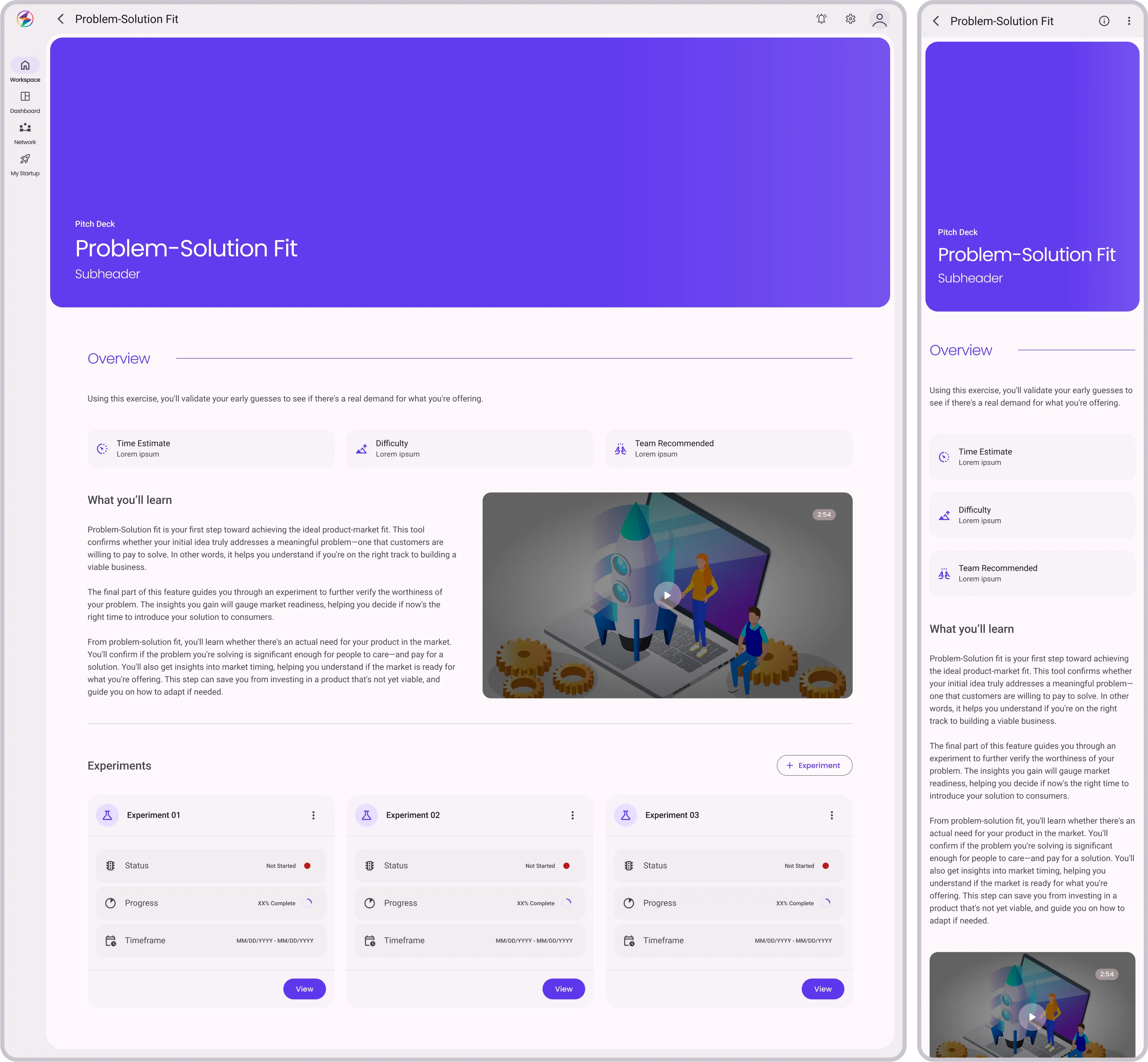
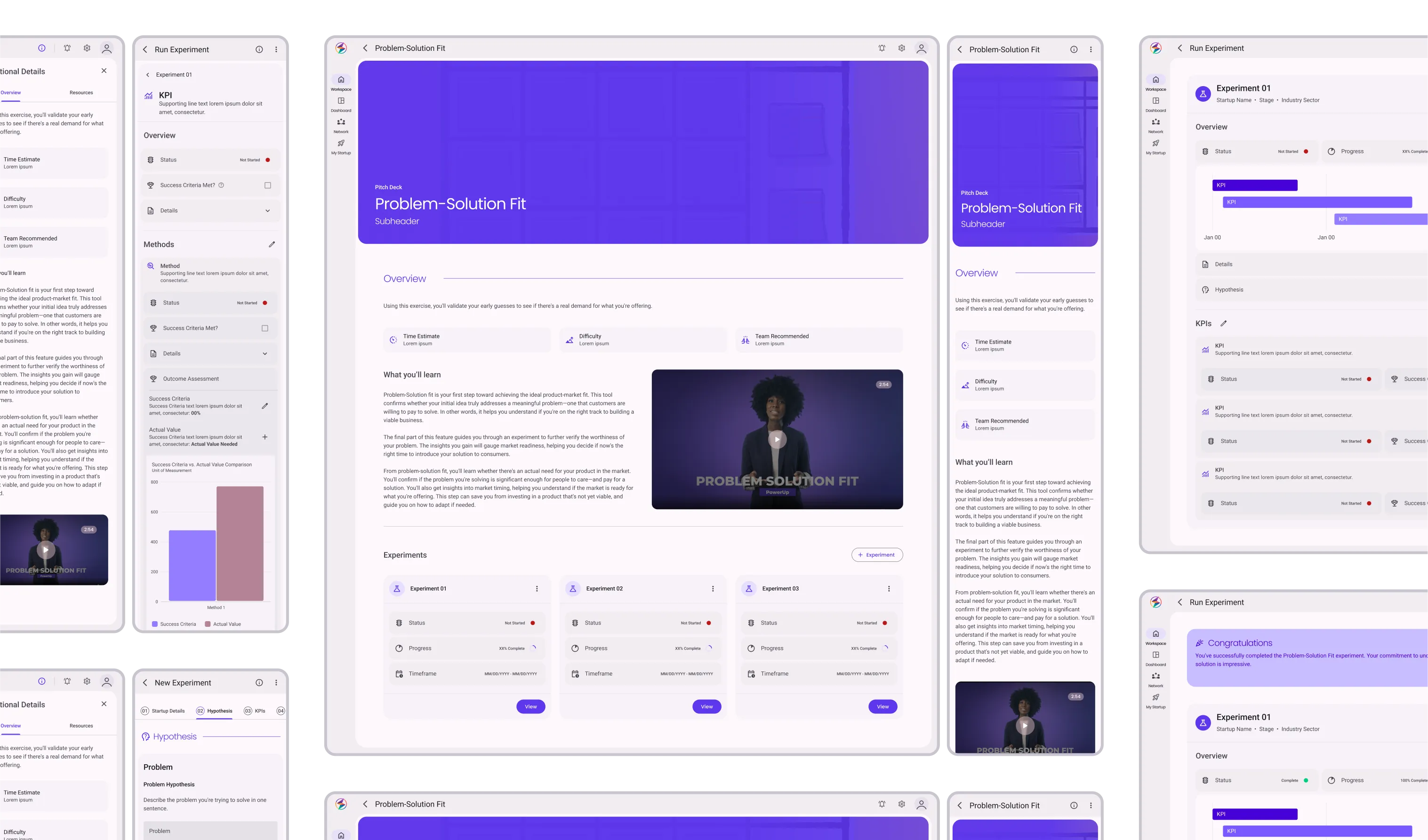
Problem-Solution Fit is the first and foundational Learning Unit in the Pitch Deck Learning Path, crucial for founders to align their solutions with market needs.

This unit guides founders in identifying a key problem and precisely aligning their solution to it, an essential step before pitching to investors.

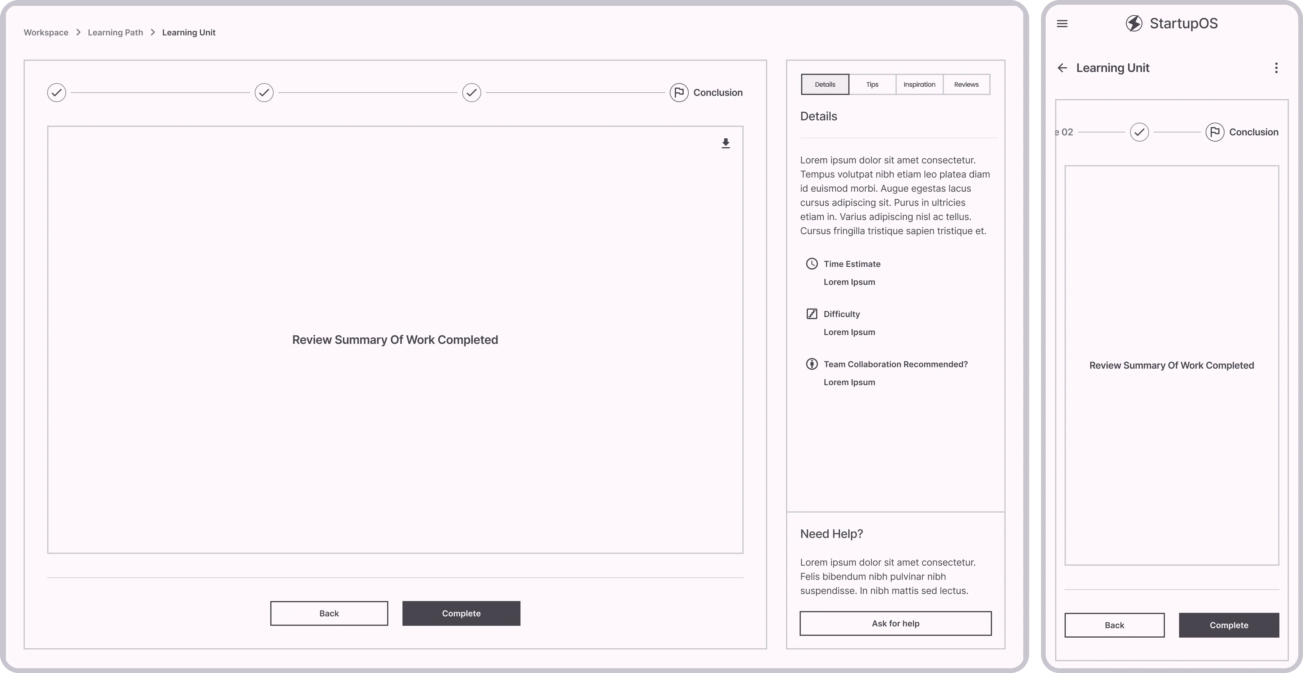
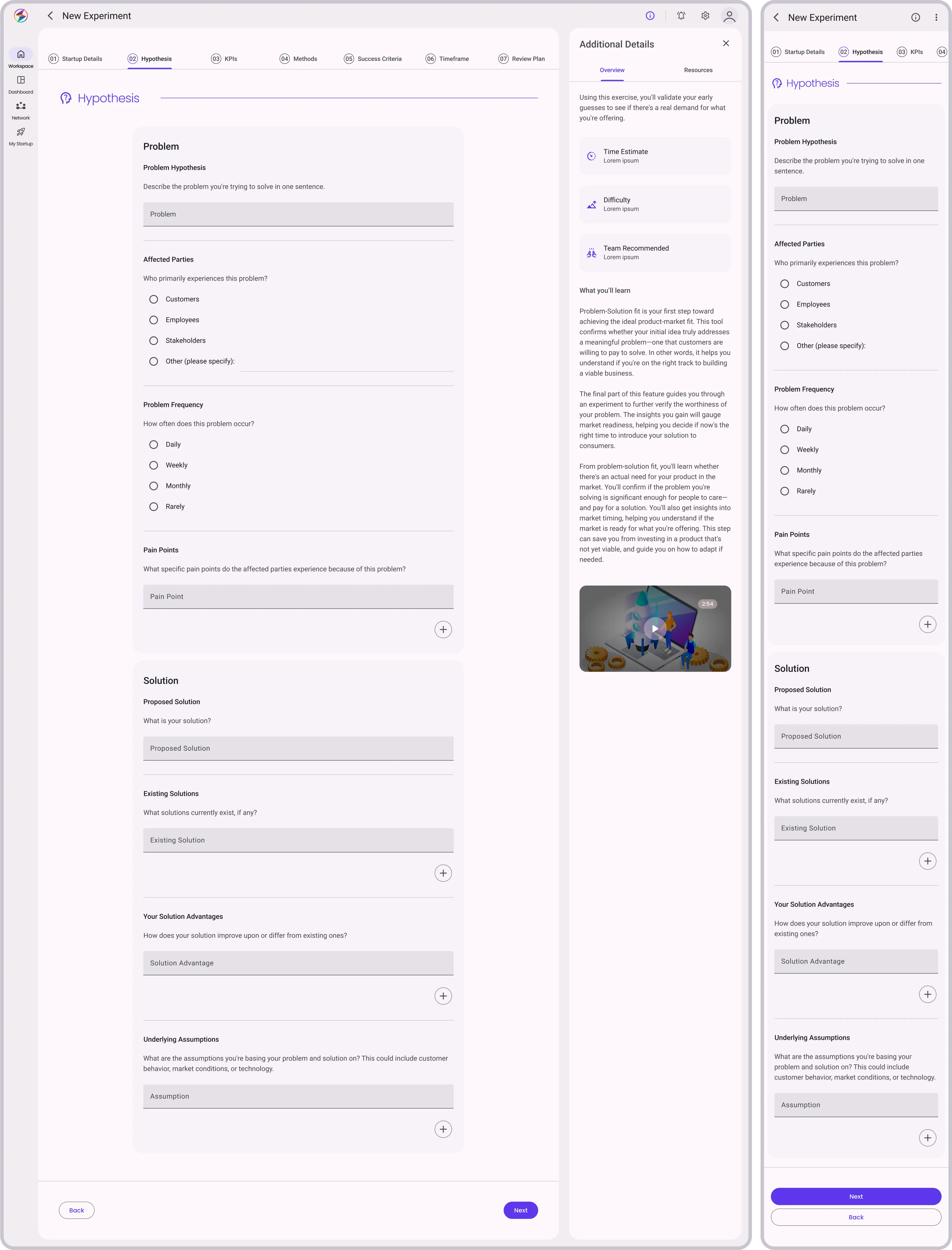
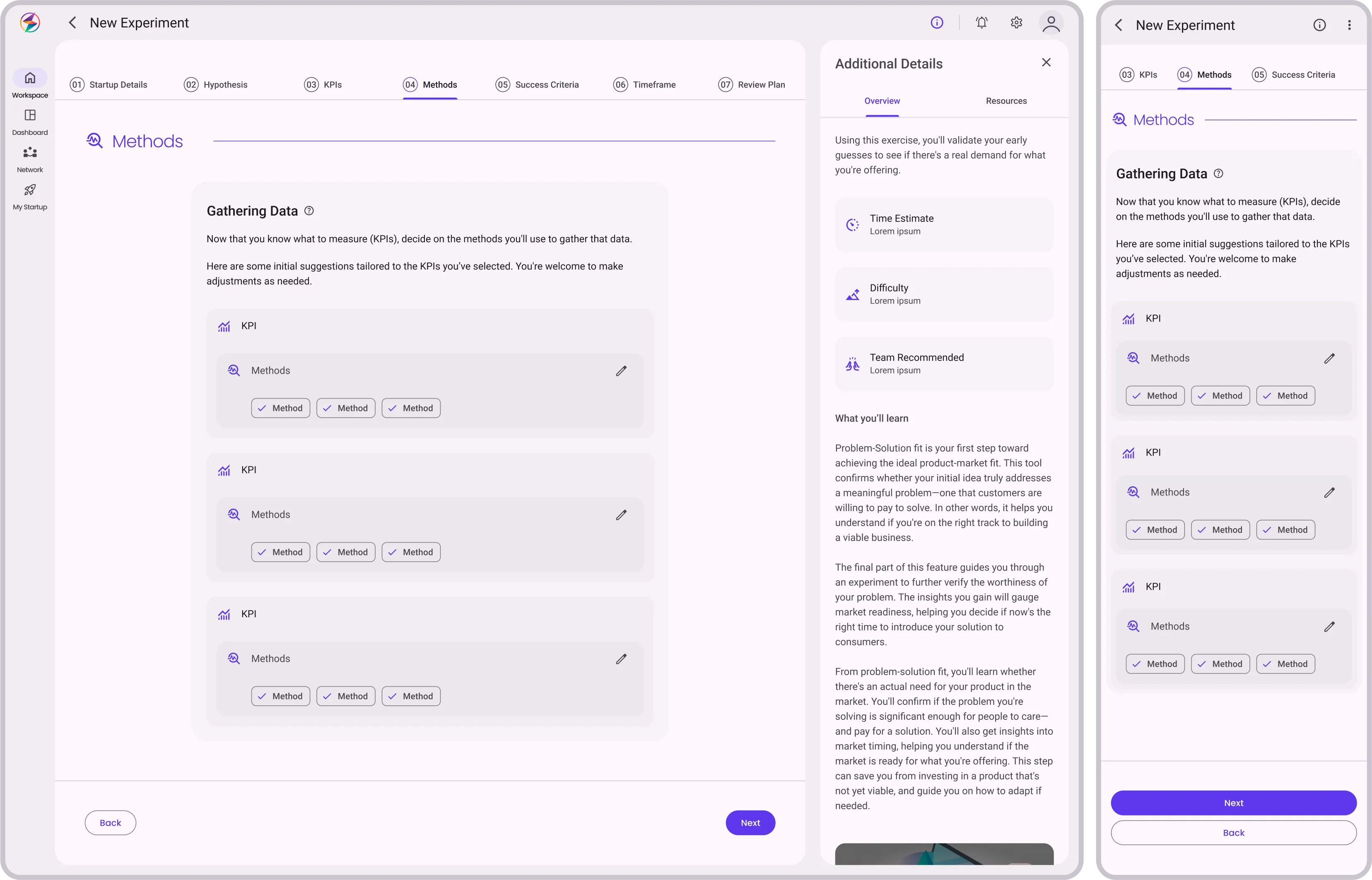
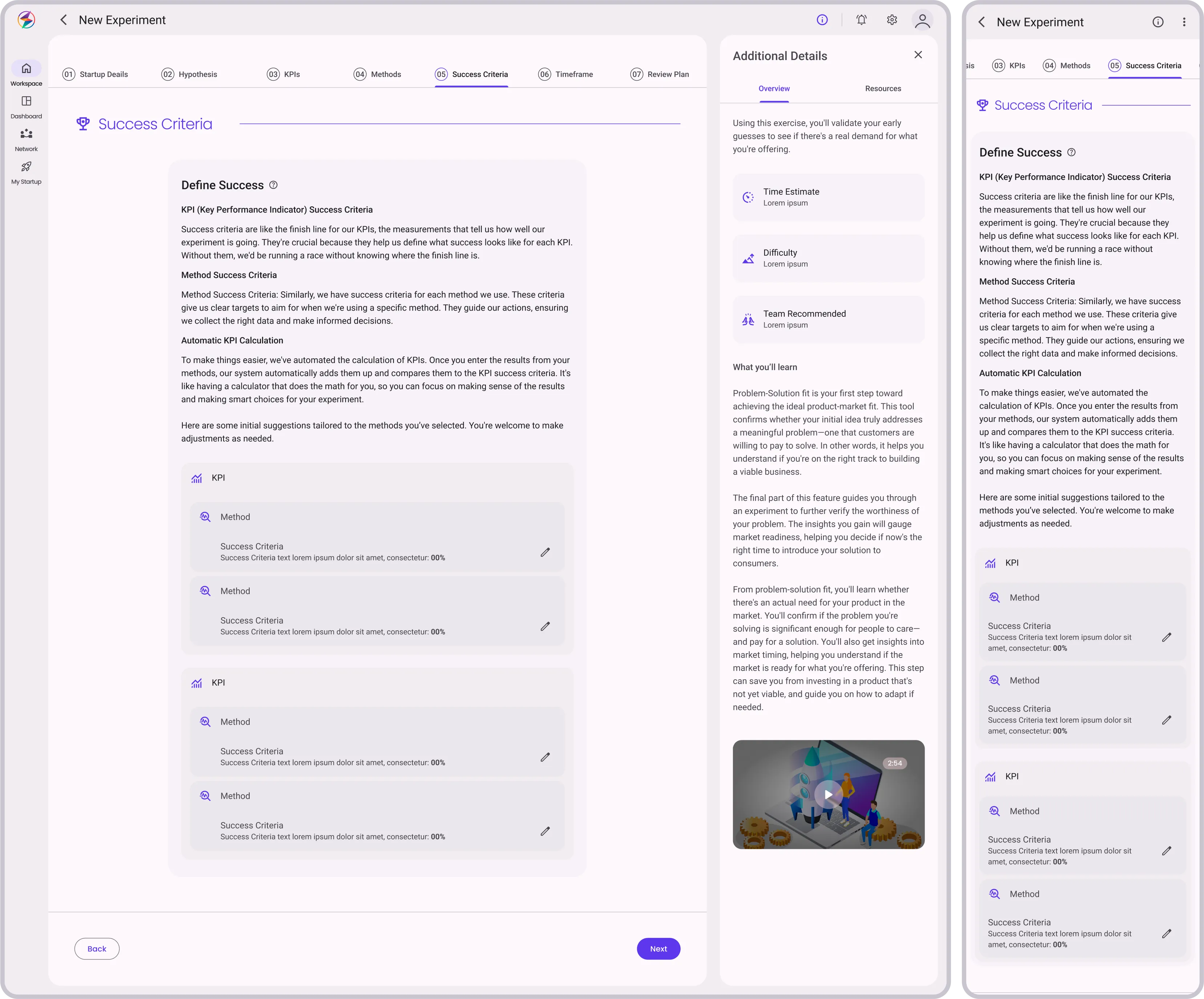
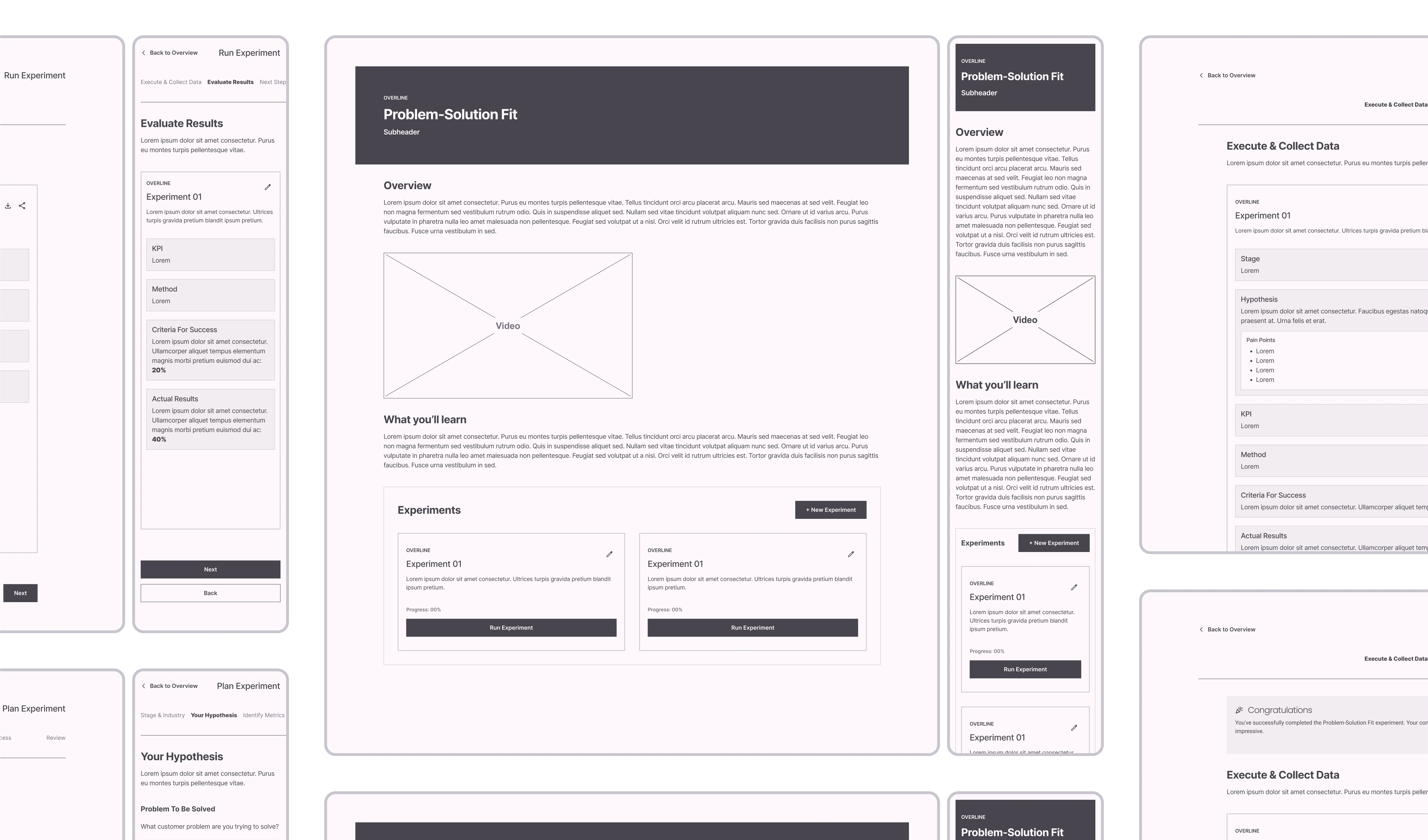
In designing Problem-Solution Fit, we focused on simplifying the concept for founders. Wireframes laid out each interaction within the unit, streamlining the experience from start to finish.

01
Overview
add
UI
Description, video, what to expect
Experiments Dashboard with options to:
  • Create a new experiment
  • Modify or continue existing experiments
  • View history of past experiments for comparison
User
Reviews info, chooses based on current need:
  • "New Experiment"
  • "Modify Experiment"
  • "Run Experiment"
Nav
  • "New Experiment": Starts new Plan Experiment cycle
  • "Modify Experiment": Go back to Review in existing Plan Experiment cycle for adjustments
  • "Run Experiment": Commits existing plan and moves to Run Experiment cycle
Stage & Industry
add
UI
Form to confirm startup stage and industry
User
Confirm or change the stage and industry
Nav
  • "Next"
  • "Back" - Not visible if previous step is Overview
Your Hypothesis
add
UI
  • Text box with prompt "What customer problem are you trying to solve?"
  • Pain point/solution form fields with option to add more
User
Input their hypotheses about customer problems and solutions
Nav
  • "Next"
  • "Back"
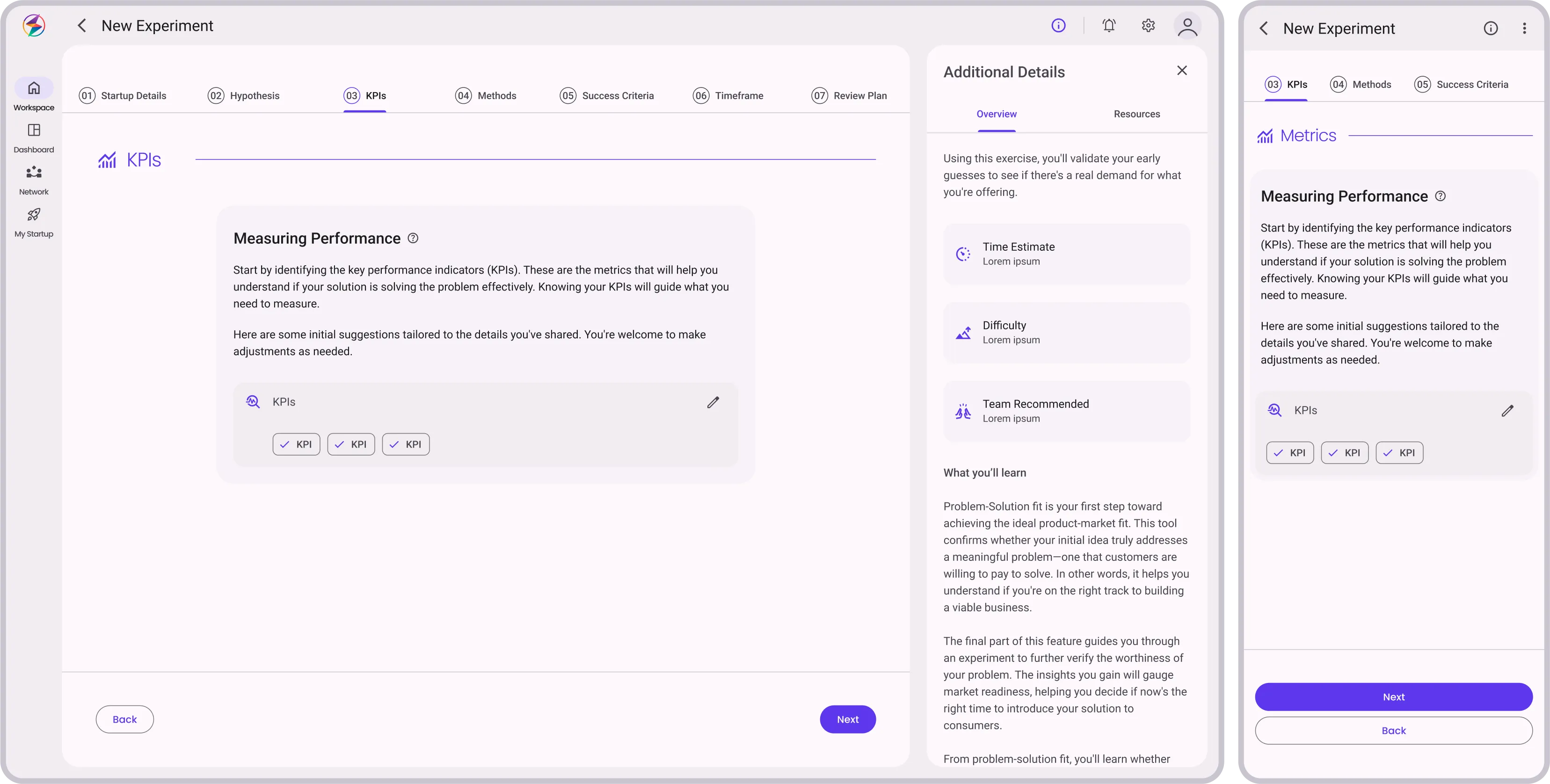
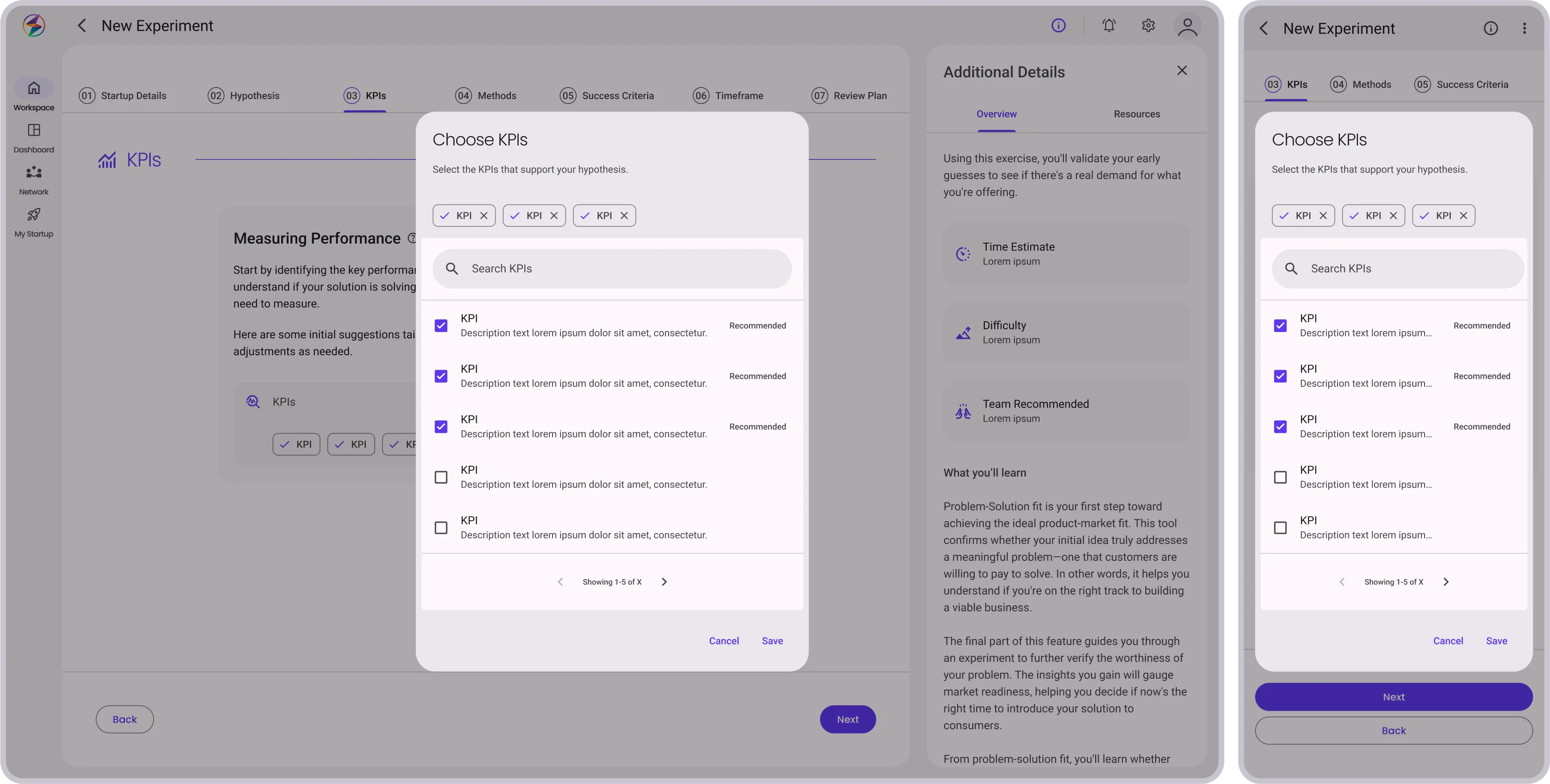
Identify Metrics
add
UI
Multiple-choice questions asking which KPIs will validate/invalidate the hypothesis
User
Choose appropriate KPIs
Nav
  • "Next"
  • "Back"
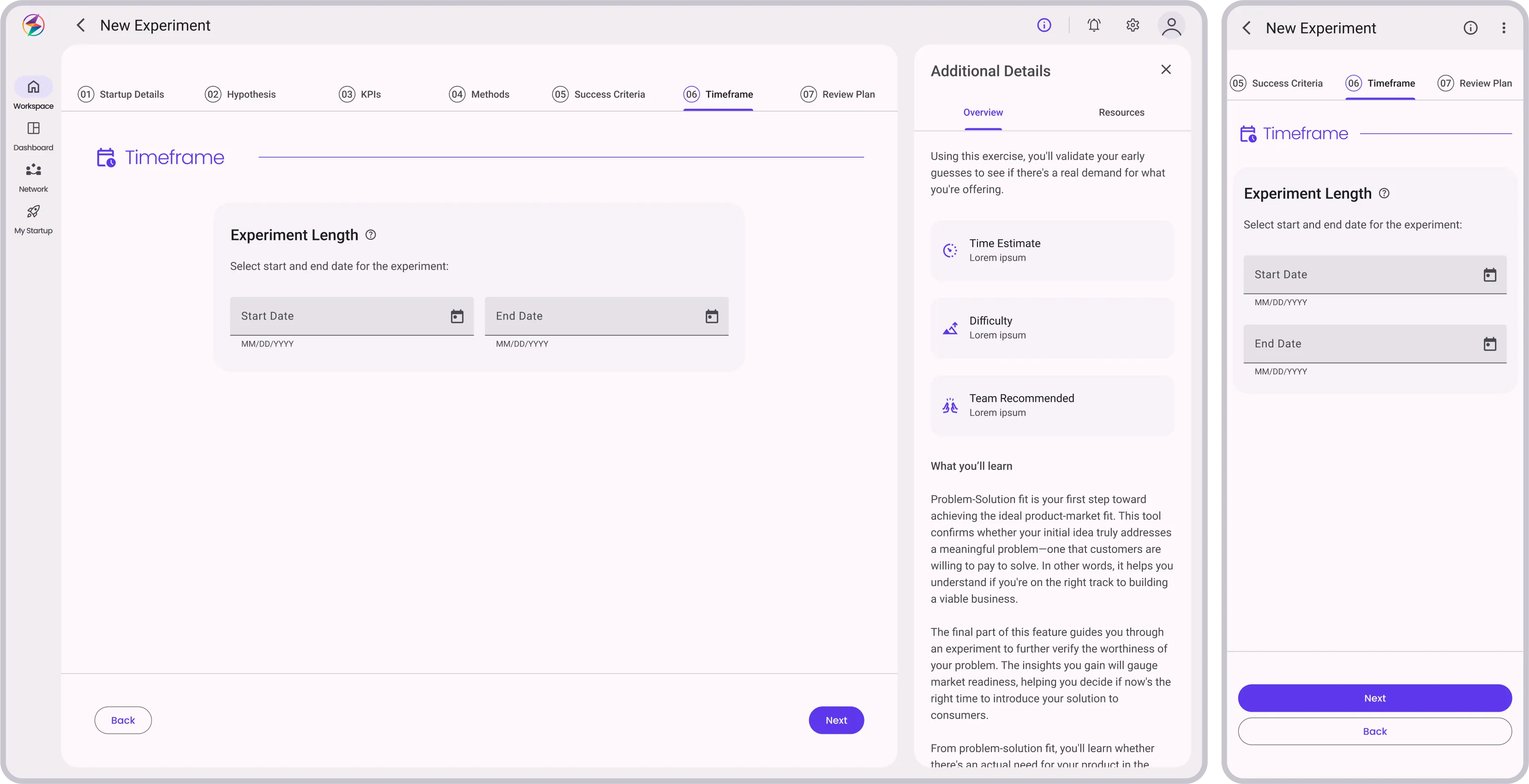
Set Timeframe
add
UI
Calendar or date-range picker
User
Select start and end date for the experiment
Nav
  • "Next"
  • "Back"
Choose Method
add
UI
List of methods (Customer interviews, surveys, MVP testing, etc.)
User
Pick one or more methods
Nav
  • "Next"
  • "Back"
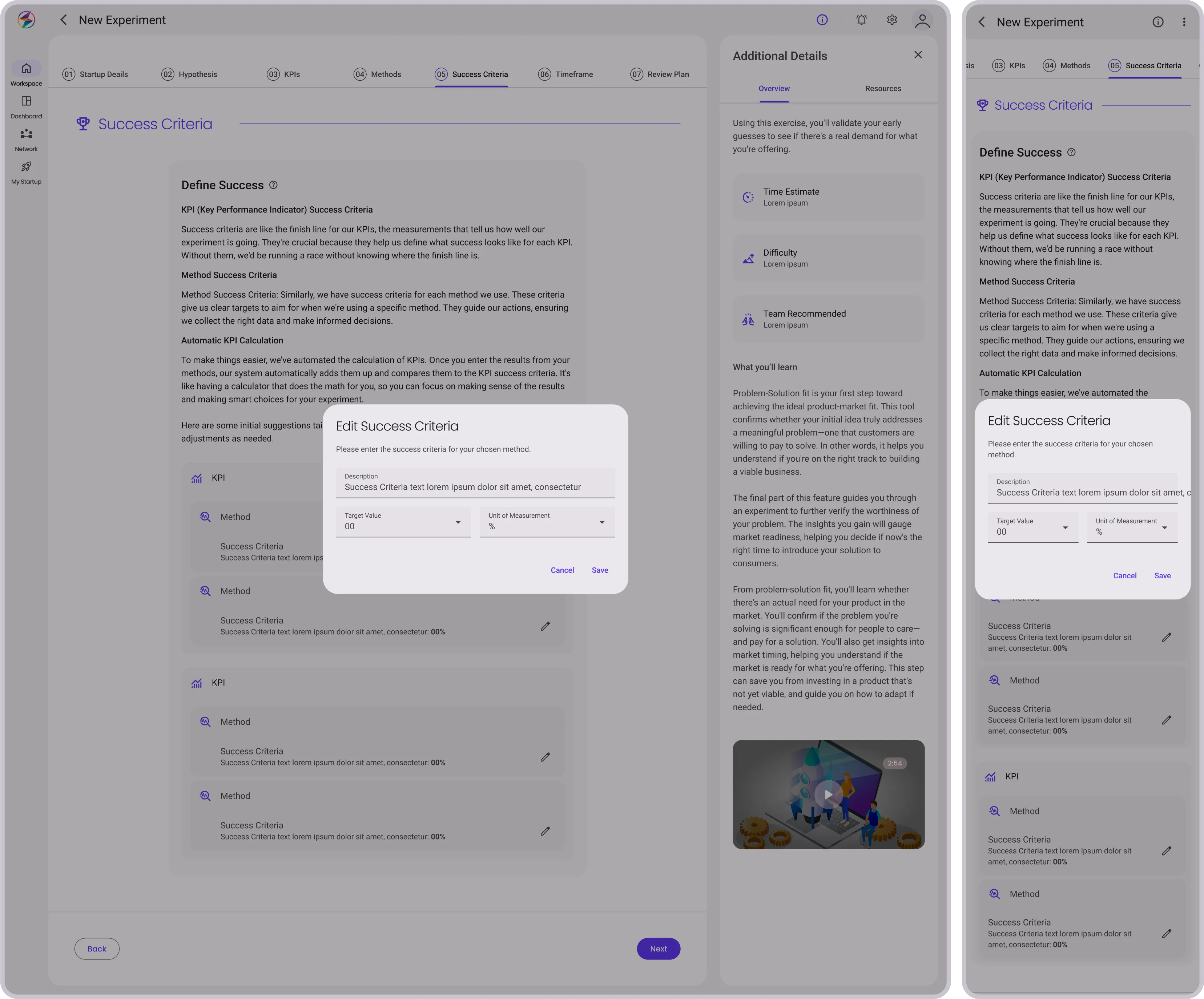
Criteria for Success
add
UI
Text box to describe what success looks like
User
Type in success criteria
Nav
  • "Next"
  • "Back"
Review Experiment Plan
add
UI
Summary screen showing all the experiment details, with options to modify details
User
Review the experiment plan and choose next steps
Nav
  • "Finish": Takes user back to Overview
  • "Run Experiment": Commits existing plan and moves to Run Experiment cycle
  • "Back"
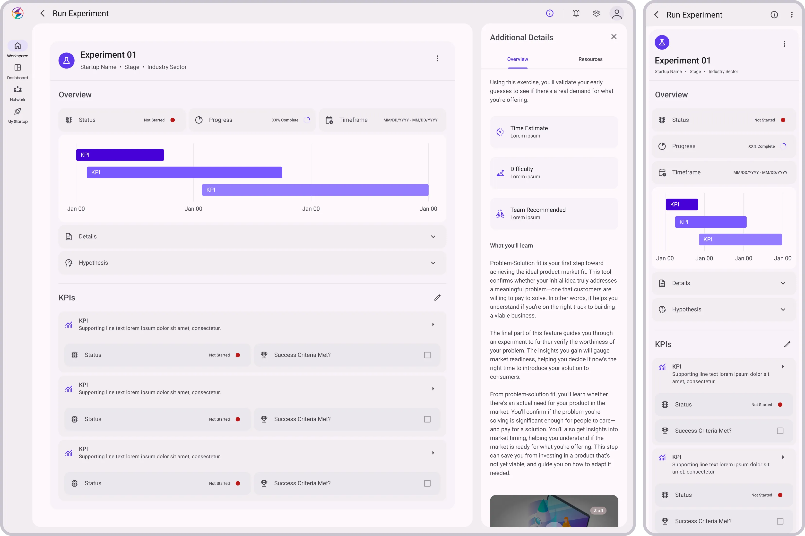
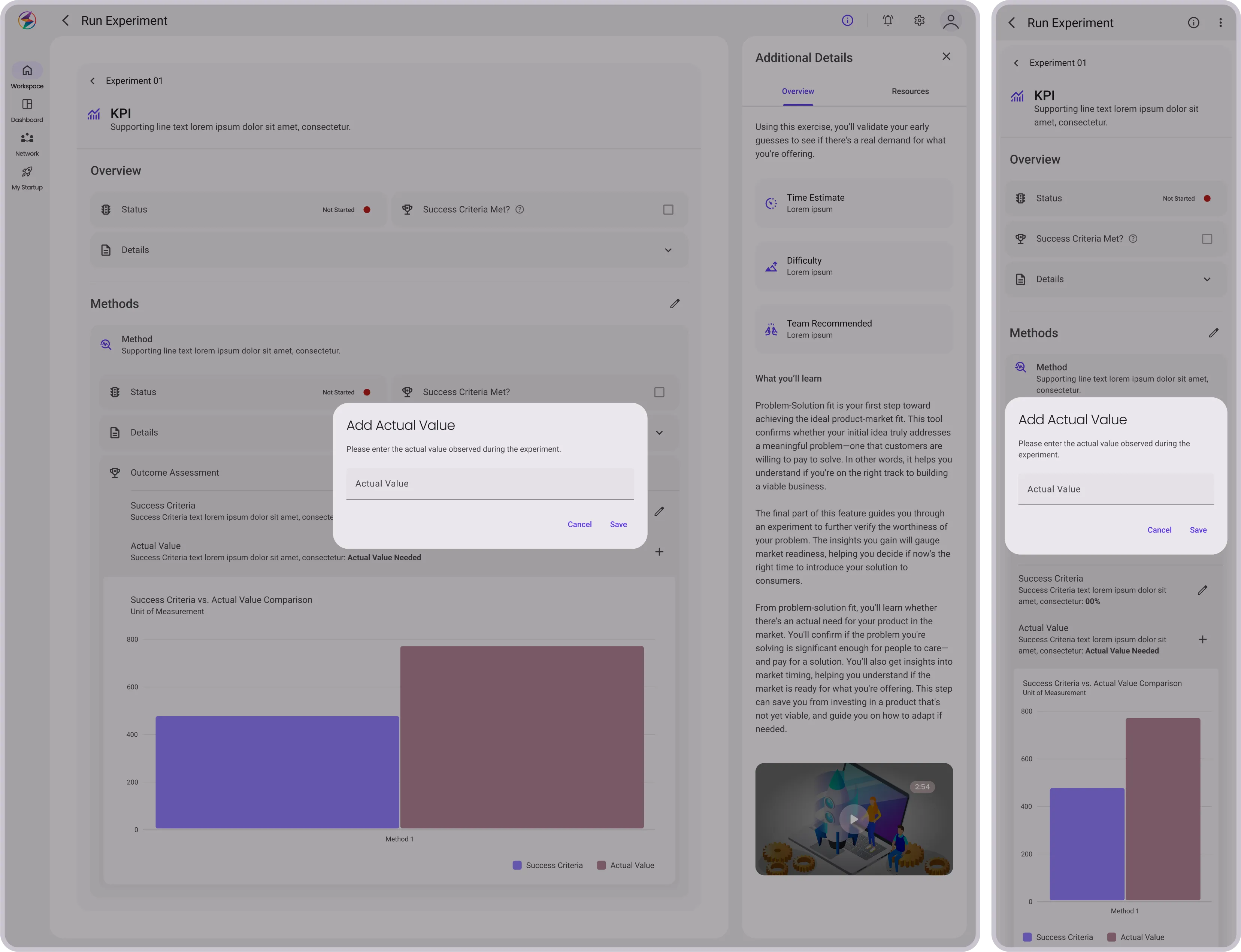
Execute & Collect Data
add
UI
A tracking dashboard that monitors chosen KPIs and allows for data input
User
Collect data according to the chosen method, inputting it manually
Nav
  • "Back"
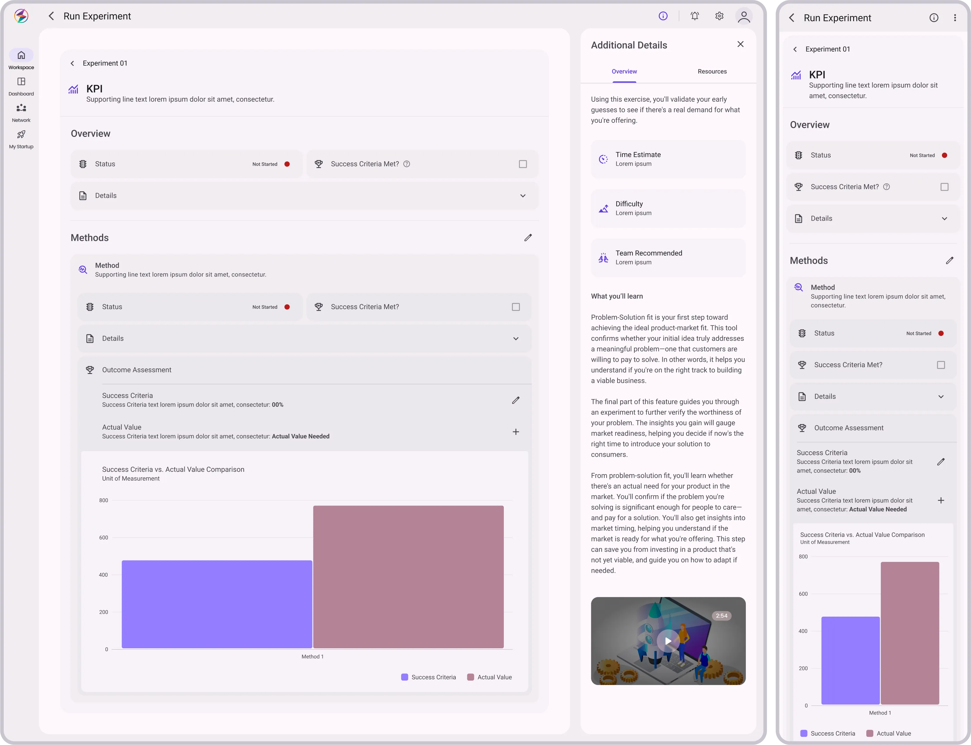
Evaluate Results
add
UI
A results screen displaying:
  • Data, analytics, and whether the hypothesis was validated
  • Feedback Loop: Share results with team members
  • Export Data: Option to export data and insights
User
Review the results and insights
Nav
  • "Back"
Next Steps
add
UI
Recommendations to proceed and pivot, iterate, or scale
User
Choose to:
  • Proceed with building the solution
  • Go back and refine the problem-solution fit
  • Move on to another experiment
Nav
  • "Finish": Takes user back to Overview
  • "New Experiment": Starts new Plan Experiment cycle
  • "Back"

Problem-Solution Fit User Flow

In designing Problem-Solution Fit, we focused on simplifying the concept for founders. The flow laid out each interaction within the unit, streamlining the experience from start to finish.

Overview
add
UI
Description, video, what to expect
Experiments Dashboard with options to:
  • Create a new experiment
  • Modify or continue existing experiments
  • View history of past experiments for comparison
User
Reviews info, chooses based on current need:
  • "New Experiment"
  • "Modify Experiment"
  • "Run Experiment"
Nav
  • "New Experiment": Starts new Plan Experiment cycle
  • "Modify Experiment": Go back to Review in existing Plan Experiment cycle for adjustments
  • "Run Experiment": Commits existing plan and moves to Run Experiment cycle
Plan Experiement
arrow_drop_down
Plan Experiement
arrow_drop_down
arrow_drop_down
arrow_drop_down
Stage & Industry
add
UI
Form to confirm startup stage and industry
User
Confirm or change the stage and industry
Nav
  • "Next"
  • "Back" - Not visible if previous step is Overview
arrow_drop_down
arrow_drop_down
Your Hypothesis
add
UI
  • Text box with prompt "What customer problem are you trying to solve?"
  • Pain point/solution form fields with option to add more
User
Input their hypotheses about customer problems and solutions
Nav
  • "Next"
  • "Back"
arrow_drop_down
arrow_drop_down
Identify Metrics
add
UI
Multiple-choice questions asking which KPIs will validate/invalidate the hypothesis
User
Choose appropriate KPIs
Nav
  • "Next"
  • "Back"
arrow_drop_down
arrow_drop_down
Set Timeframe
add
UI
Calendar or date-range picker
User
Select start and end date for the experiment
Nav
  • "Next"
  • "Back"
arrow_drop_down
arrow_drop_down
Choose Method
add
UI
List of methods (Customer interviews, surveys, MVP testing, etc.)
User
Pick one or more methods
Nav
  • "Next"
  • "Back"
arrow_drop_down
arrow_drop_down
Criteria for Success
add
UI
Text box to describe what success looks like
User
Type in success criteria
Nav
  • "Next"
  • "Back"
arrow_drop_down
arrow_drop_down
Review Experiment Plan
add
UI
Summary screen showing all the experiment details, with options to modify details
User
Review the experiment plan and choose next steps
Nav
  • "Finish": Takes user back to Overview
  • "Run Experiment": Commits existing plan and moves to Run Experiment cycle
  • "Back"
Run Experiement
arrow_drop_down
Run Experiement
arrow_drop_down
arrow_drop_down
arrow_drop_down
Execute & Collect Data
add
UI
A tracking dashboard that monitors chosen KPIs and allows for data input
User
Collect data according to the chosen method, inputting it manually
Nav
  • "Back"
arrow_drop_down
arrow_drop_down
Evaluate Results
add
UI
A results screen displaying:
  • Data, analytics, and whether the hypothesis was validated
  • Feedback Loop: Share results with team members
  • Export Data: Option to export data and insights
User
Review the results and insights
Nav
  • "Back"
arrow_drop_down
arrow_drop_down
Next Steps
add
UI
Recommendations to proceed and pivot, iterate, or scale
User
Choose to:
  • Proceed with building the solution
  • Go back and refine the problem-solution fit
  • Move on to another experiment
Nav
  • "Finish": Takes user back to Overview
  • "New Experiment": Starts new Plan Experiment cycle
  • "Back"

Concept to Code: Syncing & Troubleshooting

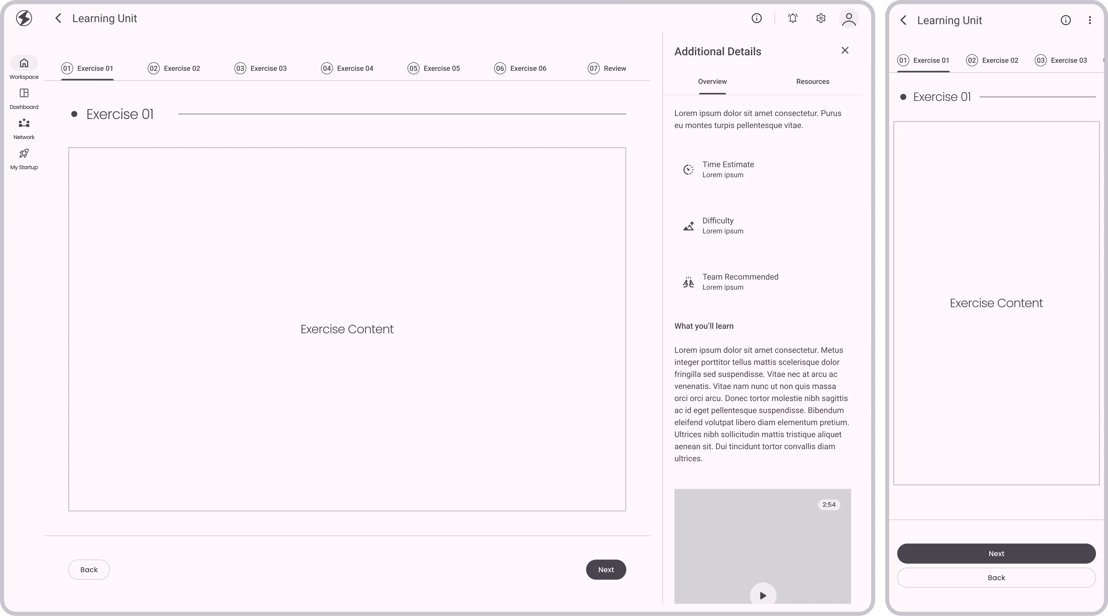
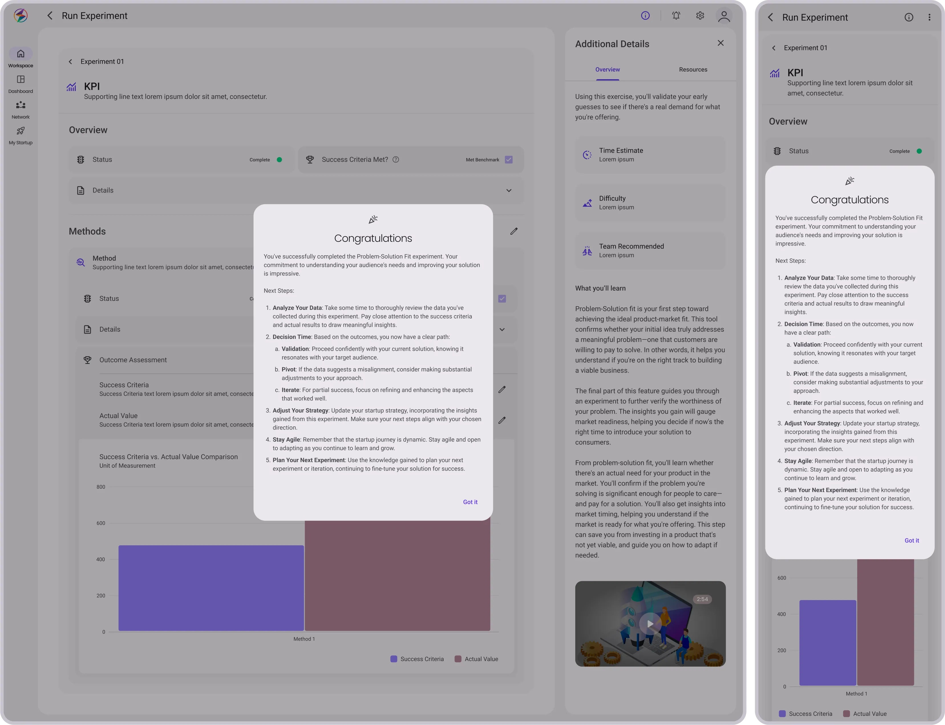
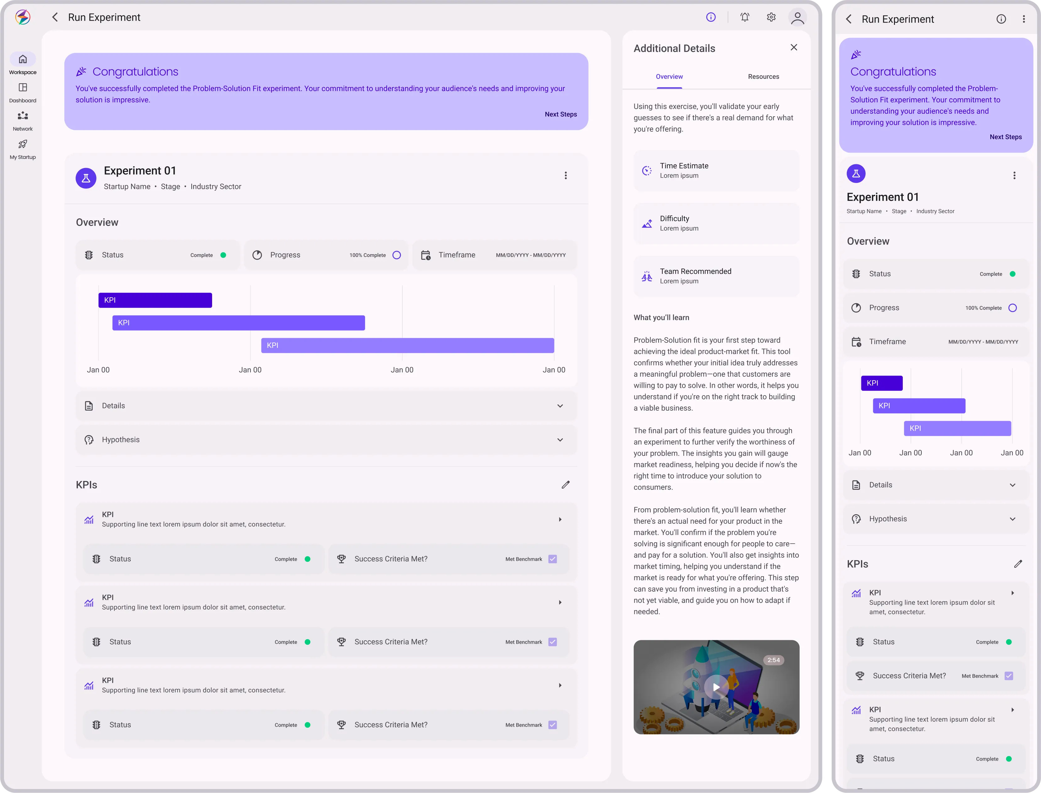
The hi-fi designs served as a direct reference for the dev team, reducing ambiguity and accelerating the build process.

Working closely with the dev team wasn't without its hurdles. Versioning issues and last-minute feature requests led to some sleepless nights. To overcome this, we held daily sync-ups, allowing us to catch potential roadblocks early and adjust our designs as needed.

View Static Images
Before
Problem-Solution Fit learning path (Before & After)
After
Problem-Solution Fit learning path (Before & After)
sync_alt
4.9
Problem-Solution Fit learning path (Before & After)
Interactive
Problem-Solution Fit learning path (Before)
4.9.A
Problem-Solution Fit learning path (Before)
Image
arrow_downward
arrow_right_alt
Problem-Solution Fit learning path (After)
4.9.B
Problem-Solution Fit learning path (After)
Image
Outcome

Celebrating Milestones, Recognizing Gaps

Results

We completed StartupOS's MVP in a demanding five-month period. The design of Learning Paths and Units helped founders improve their pitch decks. Despite challenges, our focus remained on user needs. Collaboration between design and development improved, though not without difficulties.

Positive feedback during Demo Day confirmed the platform's effectiveness. Beyond a product, we established a foundation for future scalability. Overall, the project had its obstacles but resulted in a valuable platform for startups.
Challenges

flare
Changing Executive Directives: Open dialogue and setting boundaries helped manage shifting goals.
flare
Artifact Quality: Ensuring that the artifacts created were genuinely useful for a pitch deck.
flare
Tight Deadlines: Prioritization and setting realistic expectations were key in meeting deadlines.
flare
Limited Team Size: Communication was crucial, enabling us to divide tasks efficiently and make quick decisions.
flare
Parallel Development: Daily stand-ups with the development team ensured smooth communication, minimizing errors.
flare
Limited Feedback Time: We engaged third-party contractors for additional user research and testing.
flare
Content & QA Constraints: Successfully advocated for hiring specialized roles, like a Content Designer and QA Specialist, to improve the final product.

Takeaways

flare
Communication is Key: Always translate your design language into terms that stakeholders can understand and appreciate.
flare
Prioritize Effectively: It's better to execute fewer features exceptionally well than to overextend.
flare
Agility is a Virtue: Being flexible and adaptable was vital given the evolving demands and tight deadlines.